Healthcare was complicated. We made it human.
From naming to design, we built Hippo — a bold, joyful brand simplifying how people save on prescriptions.
A healthcare brand that doesn’t just help you fill faster — it helps you fill better.
-
Hippo — Fill Better
Challenge
The U.S. prescription system is complex, confusing, and often unfair — a maze of co-pays, mail-order options, and fine print that leaves most people overpaying for essential medication.
The founders of what would become Hippo came to us with a clear mission: make it simple, make it affordable, and make it human.They had built a platform that could do what no other app could — compare real-time insurance copays and discounted prices side by side, connect directly to your plan’s prescription benefits, and even manage mail-order prescriptions for an entire family. It was a breakthrough product with enormous potential.
But before it could launch, it needed something crucial: a brand as approachable and intelligent as the technology behind it.Discovery
Working closely with the founding team and investors, we began by defining the emotional and strategic foundation. The product was built to make people’s lives easier, not to add another layer of medical jargon.
We wanted to humanize healthcare, to create a name and identity that made people smile in a category defined by red tape and small print.
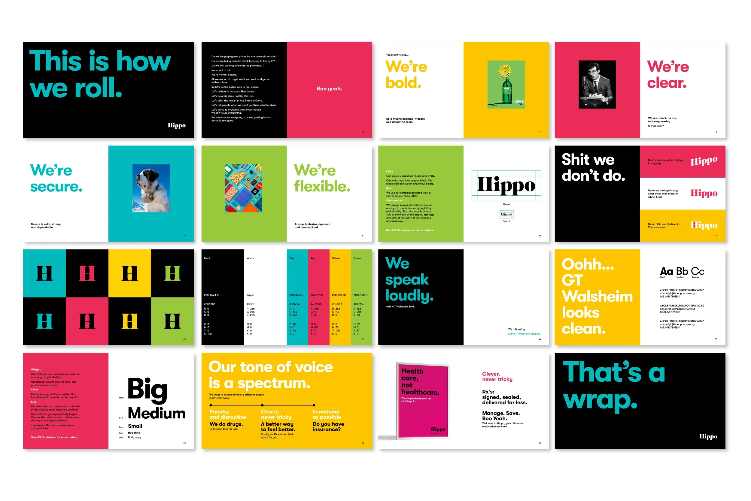
That search led us to Hippo — a name that’s friendly, confident, and disarmingly simple. The Hippo is strong yet gentle, memorable yet trustworthy — the perfect embodiment of a brand that protects people’s health and wallets.The tagline, “Fill Better,” says it all: it’s about filling prescriptions smarter, faster, and with less stress.
Craft
Our design approach was as bold and clear as the brand’s promise.
Identity & Symbol:
The custom “H” icon became the cornerstone of the system — simple, geometric, and instantly recognizable. It subtly nods to both the brand name and its promise: a bridge between people and better access to care. The mark works seamlessly across app icons, packaging, and interface moments.System & Design Language:
The brand world was built to feel vibrant, positive, and trustworthy — a deliberate shift away from the sterile blues and greys that dominate healthcare.
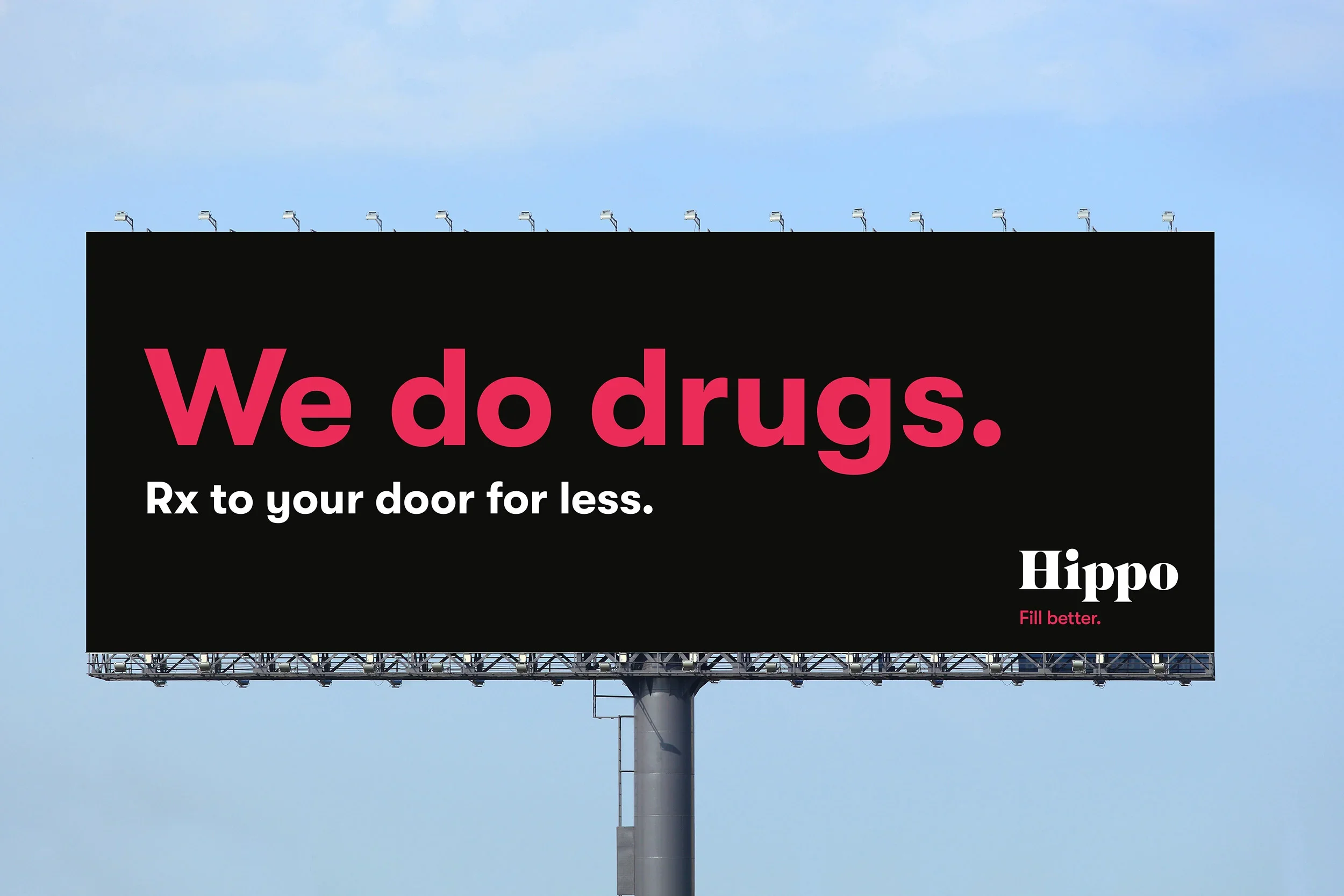
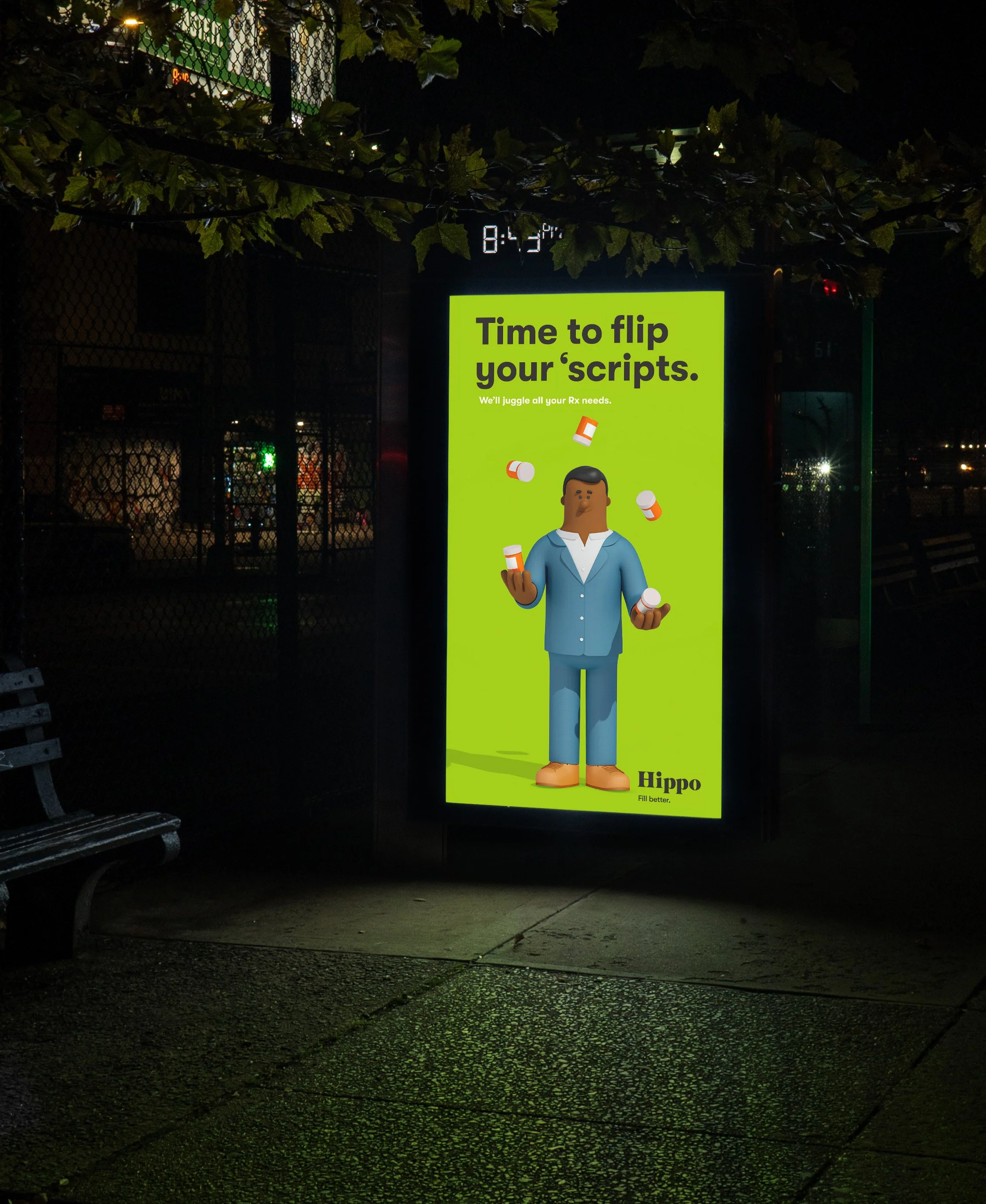
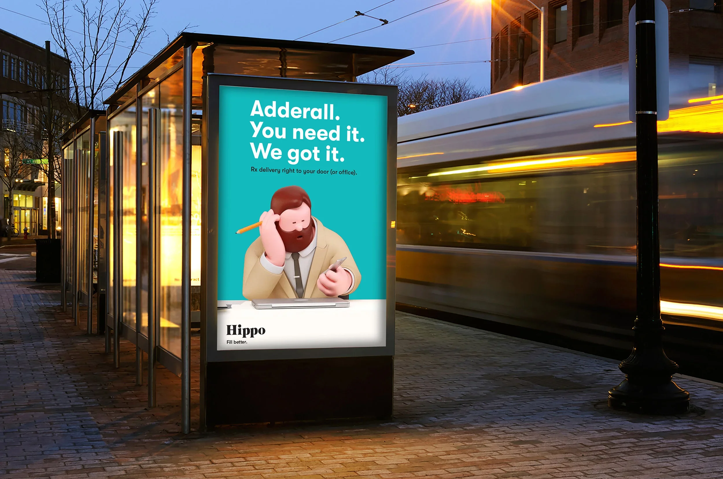
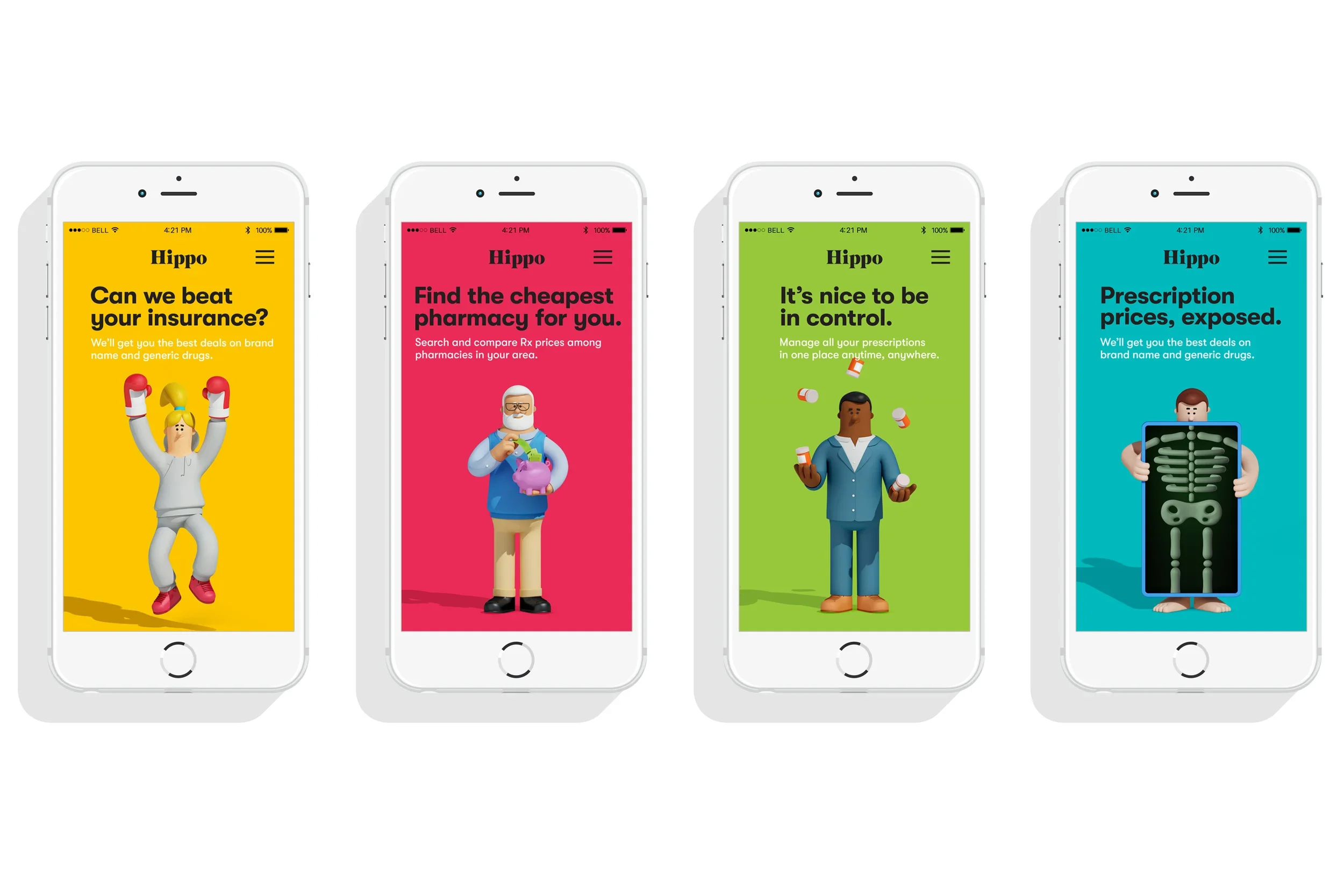
We leaned into bold color blocking, rounded typography, and clean compositions that made complex information easy to absorb.Illustration & Tone:
Partnering with a 3D illustrator, we developed a set of simple, colorful scenes that visualize everyday healthcare moments — friendly, accessible, and just the right amount of fun. These became core to Hippo’s storytelling across the app, marketing, and onboarding.Naming & Strategy:
From the ground up, we aligned naming, strategy, and design into a single ecosystem that mirrored the brand’s simplicity. Hippo wasn’t just another health-tech company — it was a promise to make prescription access feel effortless and equitable.
Outcome
The result was a brand that brought humanity back to healthcare — approachable, transparent, and unmistakably modern.
Hippo — Fill Better launched as a category disruptor, proving that even in the most complex systems, simplicity and warmth can win.The new identity gave founders and partners a cohesive platform to scale, while the design system gave users confidence that saving on medication could be as easy as ordering takeout.
Hippo doesn’t just fill prescriptions — it fills a gap the healthcare industry forgot: empathy.Description text goes here