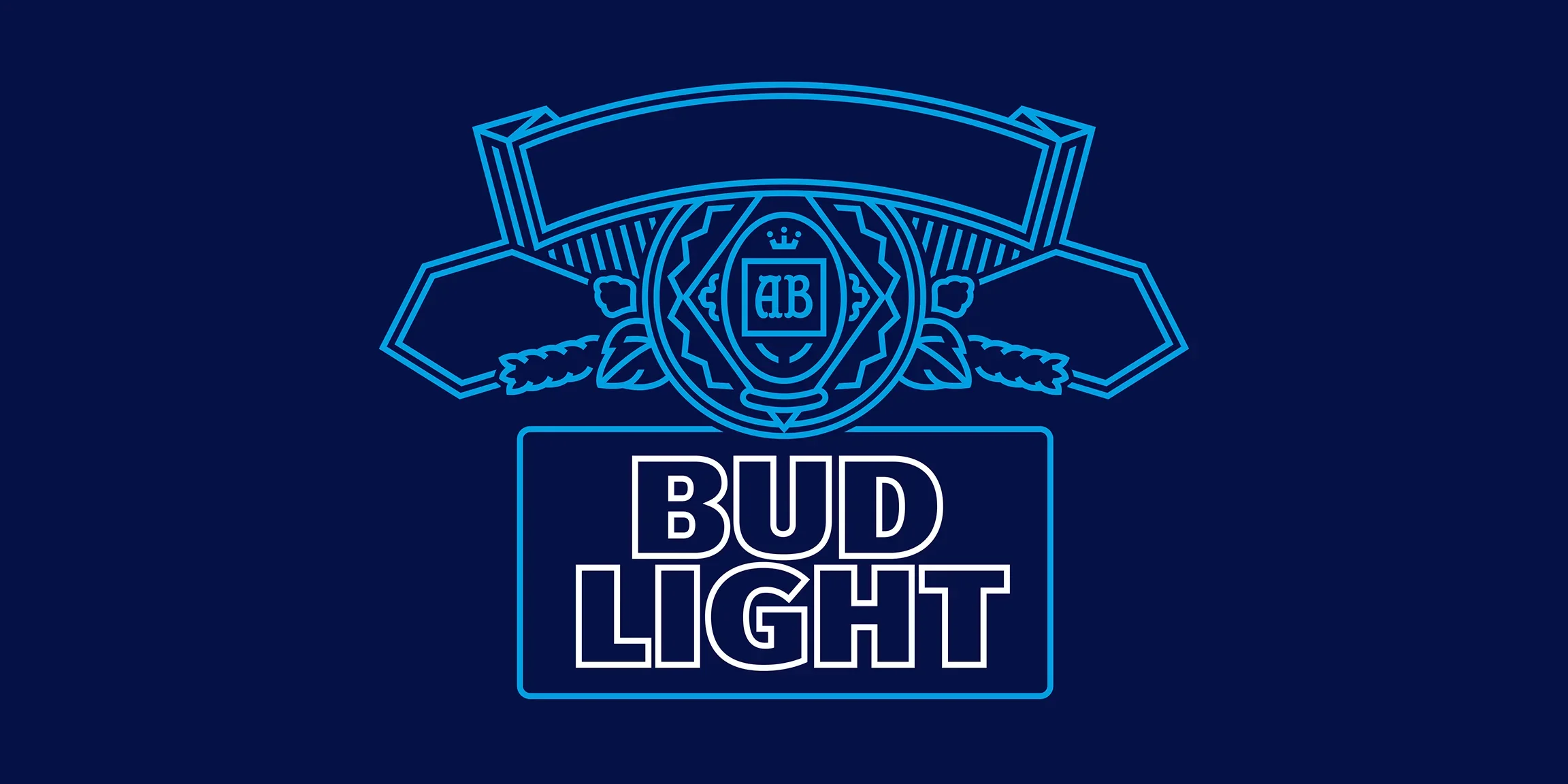
Rebranding America’s Beer
Bud Light looked tired. We rebuilt its identity from the archives up, restoring its craft, confidence, and cultural pulse.
-
THE CHALLENGEIn 2017, Bud Light’s rebrand made waves with a bold new look that won awards and industry recognition. But while the packaging succeeded, the brand itself was struggling. Sales were declining, perception was slipping, and the world around Bud Light was moving on.
The visual identity had evolved, but the brand world hadn’t caught up. Dozens of agencies, partners, and internal teams were still telling disconnected stories, working from outdated guidelines, and missing the new tone of confidence and craft introduced by the redesign. What we needed wasn’t another campaign; it was a cultural reset. A unified design system that reconnected America’s best-selling beer to its roots, and to the people who loved it.
DiscoveryTo move the brand forward, we went back in time. Our team traveled to the Budweiser archives in St. Louis, a treasure trove of hand-drawn labels, original packaging, advertising proofs, and mid-century photography. There, we uncovered what had always made Bud Light iconic: proud typography, honest craft, and a sense of American optimism that was playful, not pretentious. These discoveries reframed our mission. Rather than reinventing Bud Light, we would evolve it, using the brand’s rich history as a foundation for a more modern, cohesive, and confident system. A system that could be flexible across partners, consistent across channels, and timeless across generations.
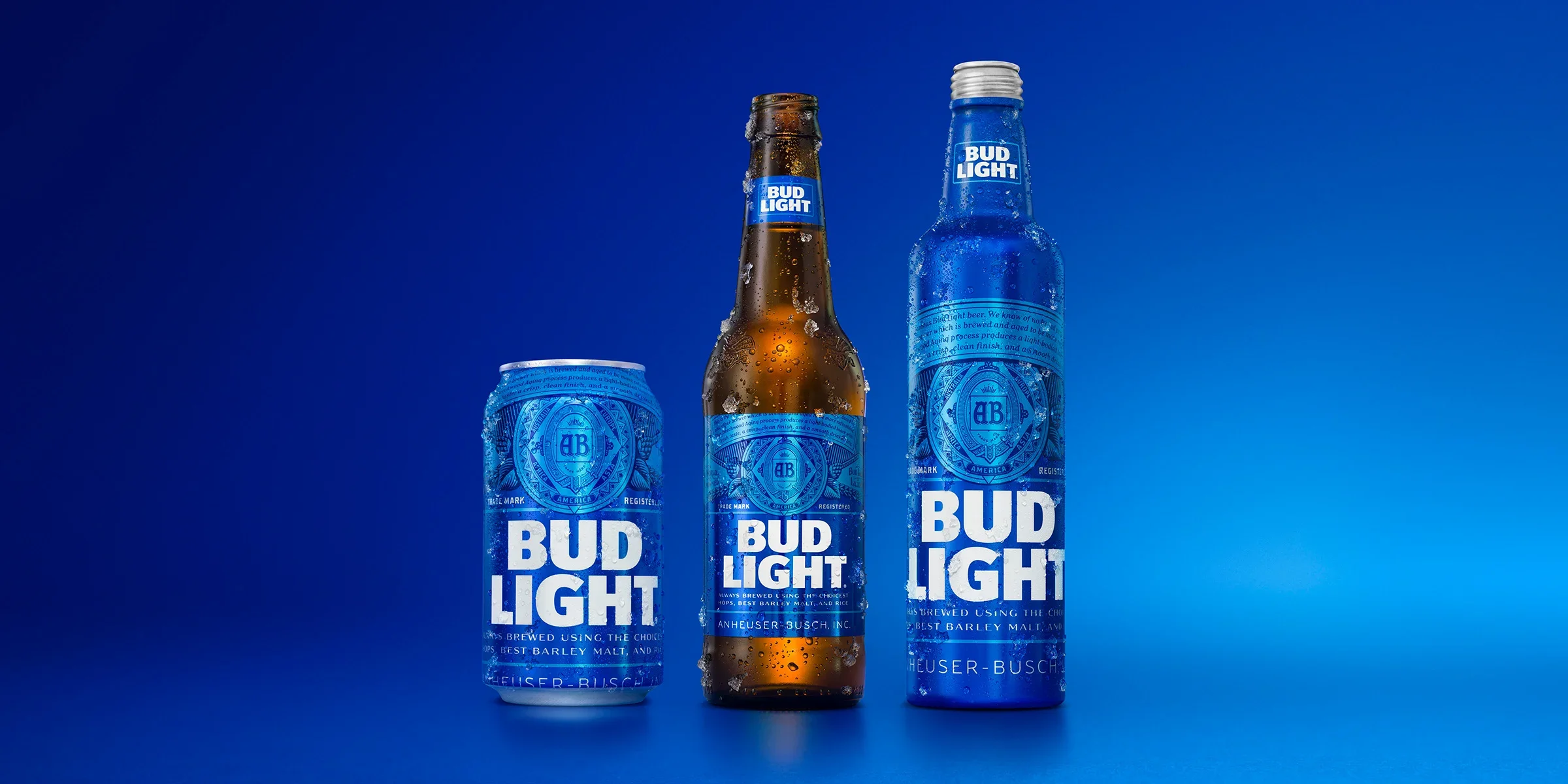
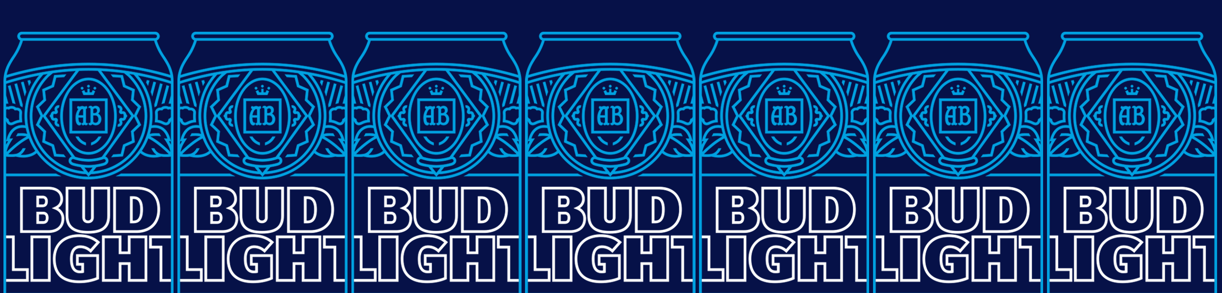
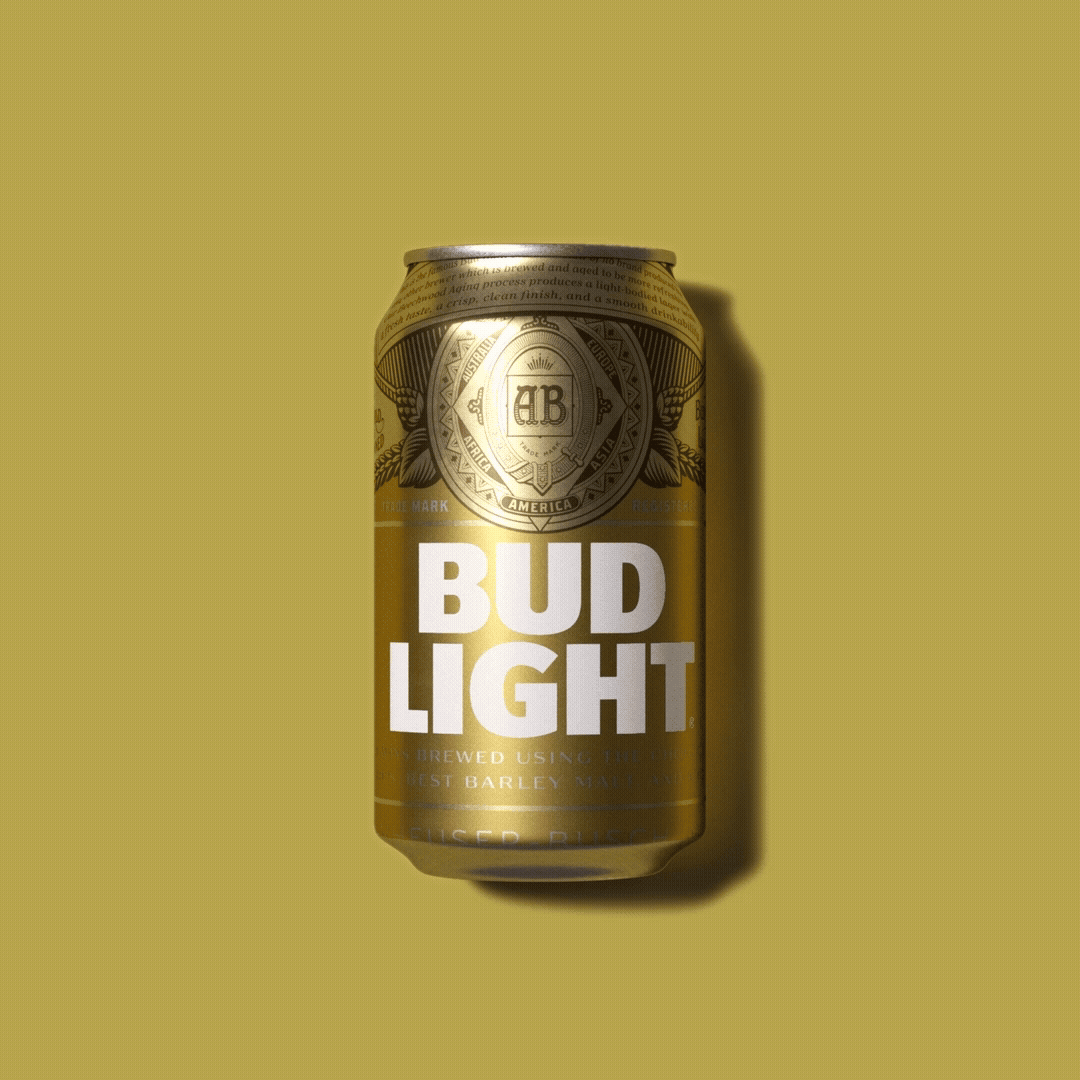
CraftThe creative rebuild started with type. Partnering with master typographer Ian Brignell, we designed a custom Bud Light typeface confident, crafted, and distinctly ownable. The letterforms drew from the engraved typography of historic labels, refined for digital and motion use, creating a link between heritage and the present.
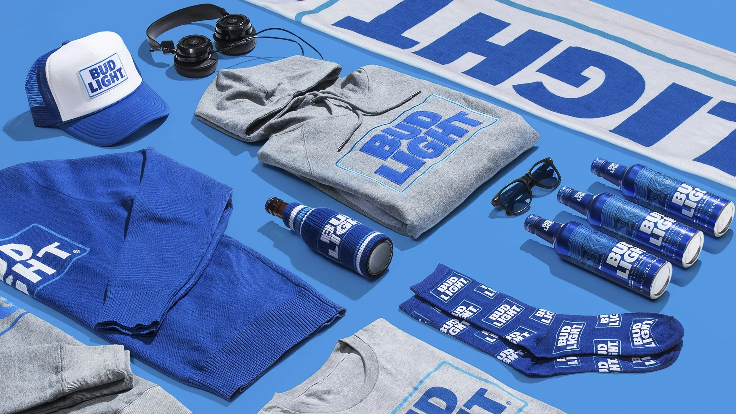
From there, we developed an expanded brand asset system:
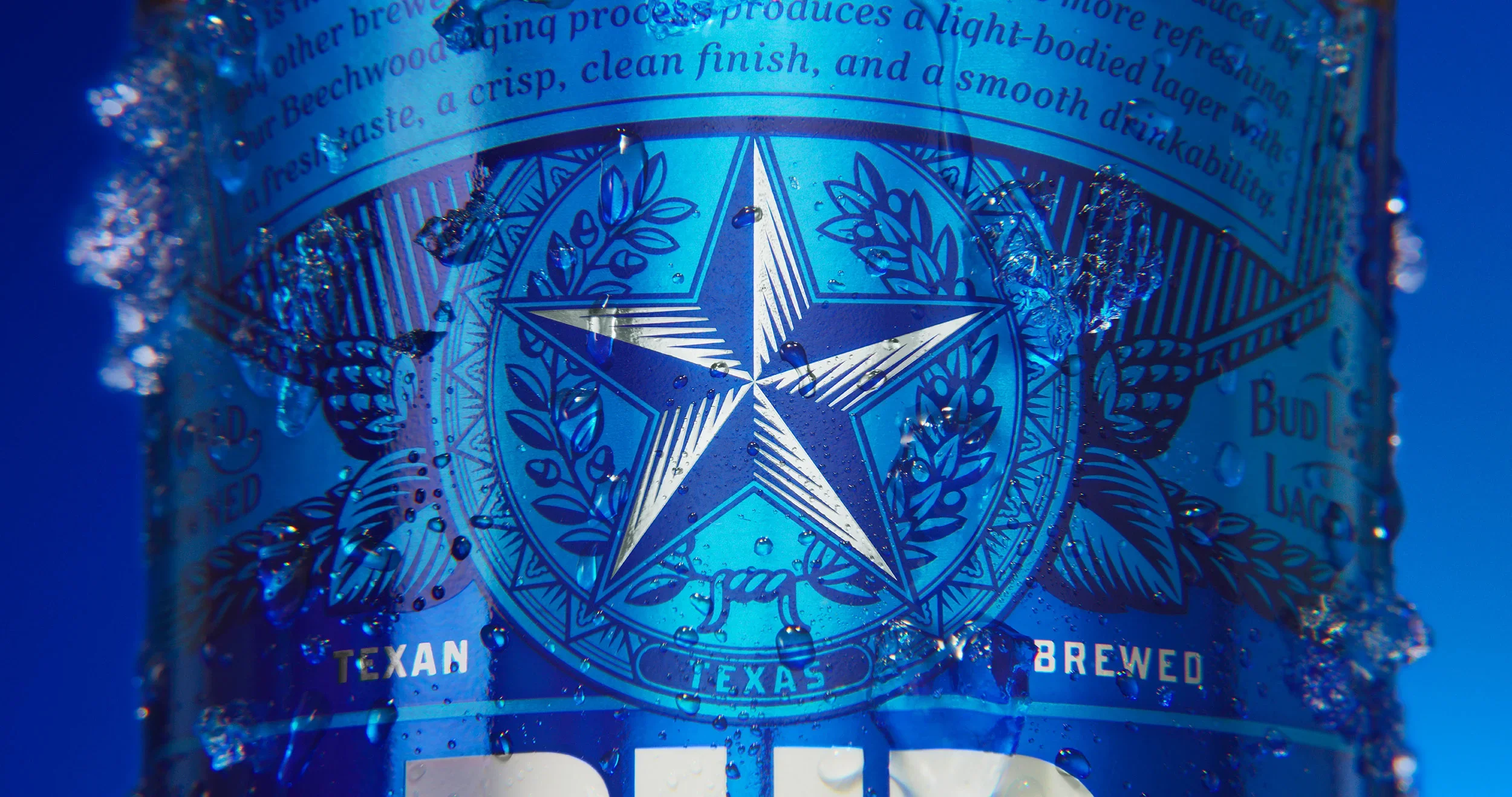
The photography direction, led in collaboration with Martin Wonnacott, blends macro pours, rich textures, and real-life moments to capture both the craft of beer and the joy of drinking it.
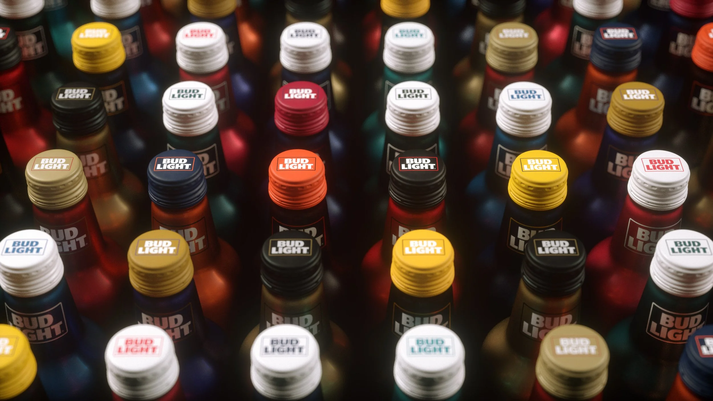
Icon illustrations were redrawn with precision and spirit, designed to live everywhere from retail to broadcast.
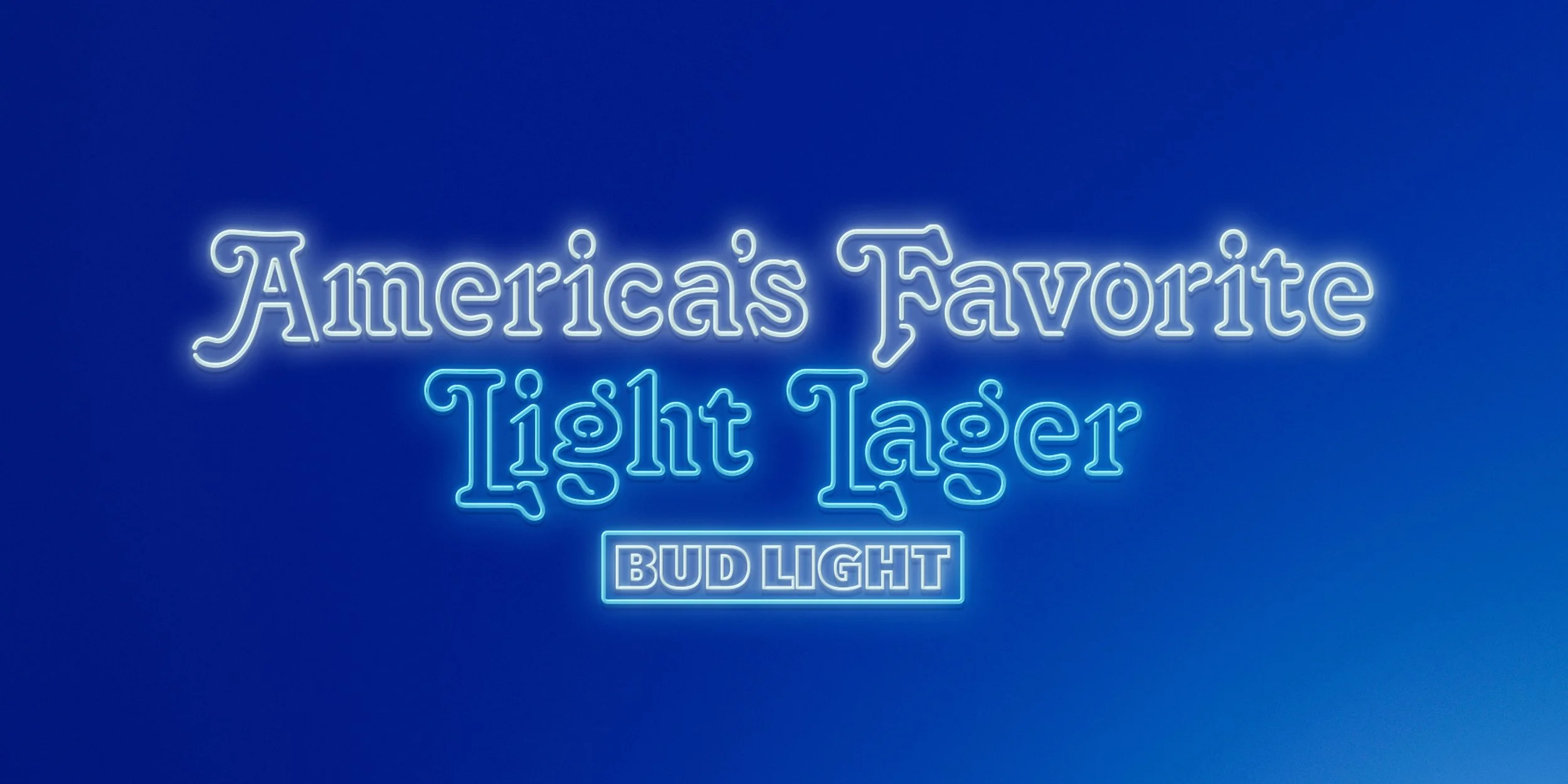
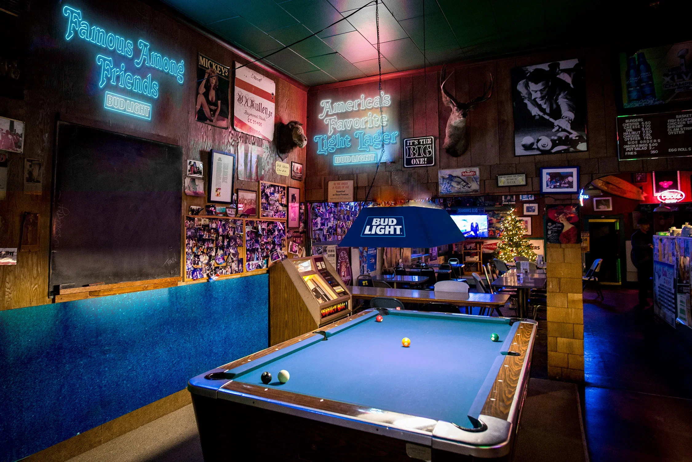
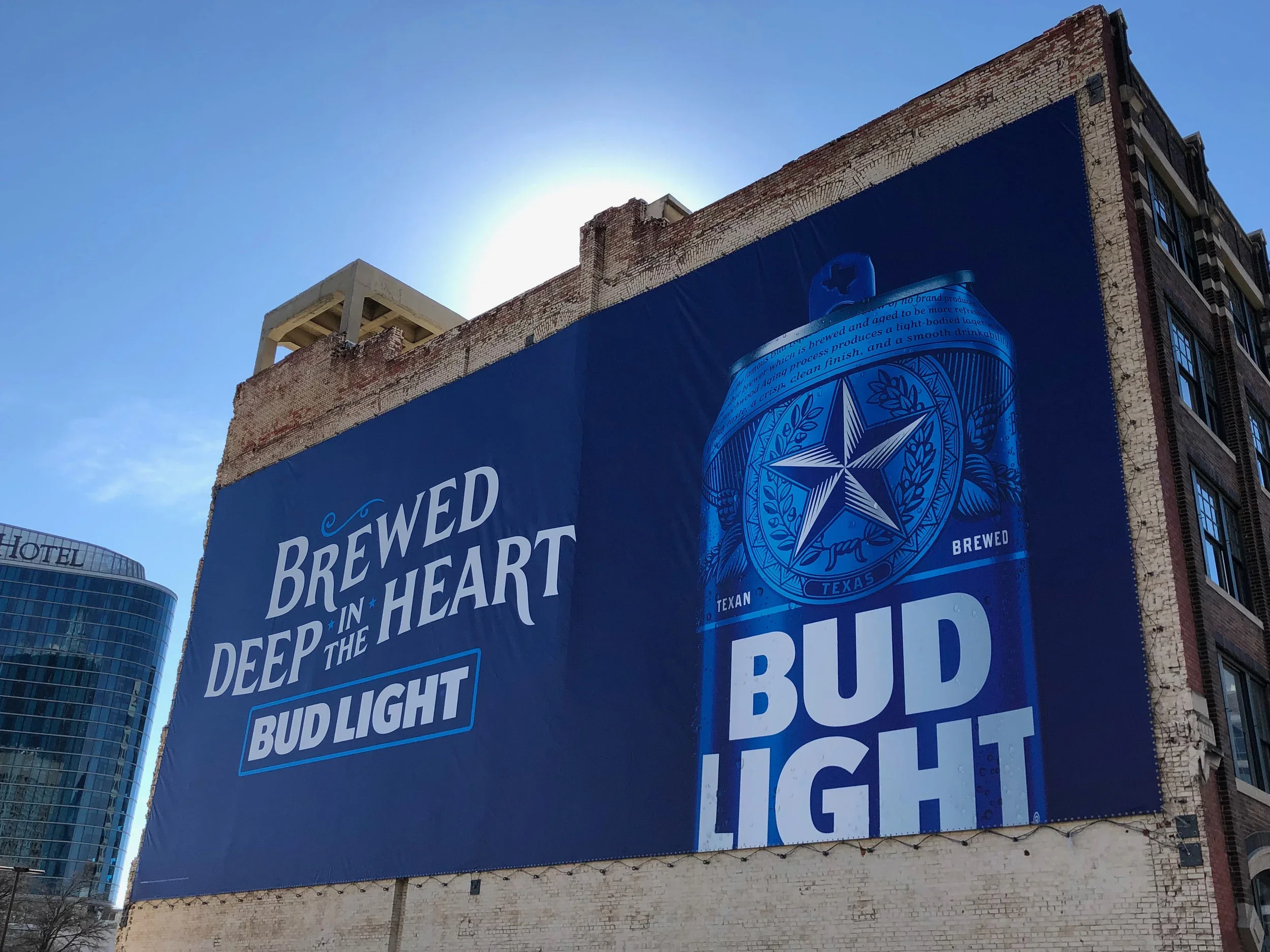
Environmental applications came to life through a custom signage typeface and neon scripts, developed with the talented team at CLUB, reintroducing character and warmth into bars, venues, and activations.
Together, these pieces formed the foundation of a new brand-world playbook, not just a guideline, but an invitation for partners and creators to build with purpose and alignment.
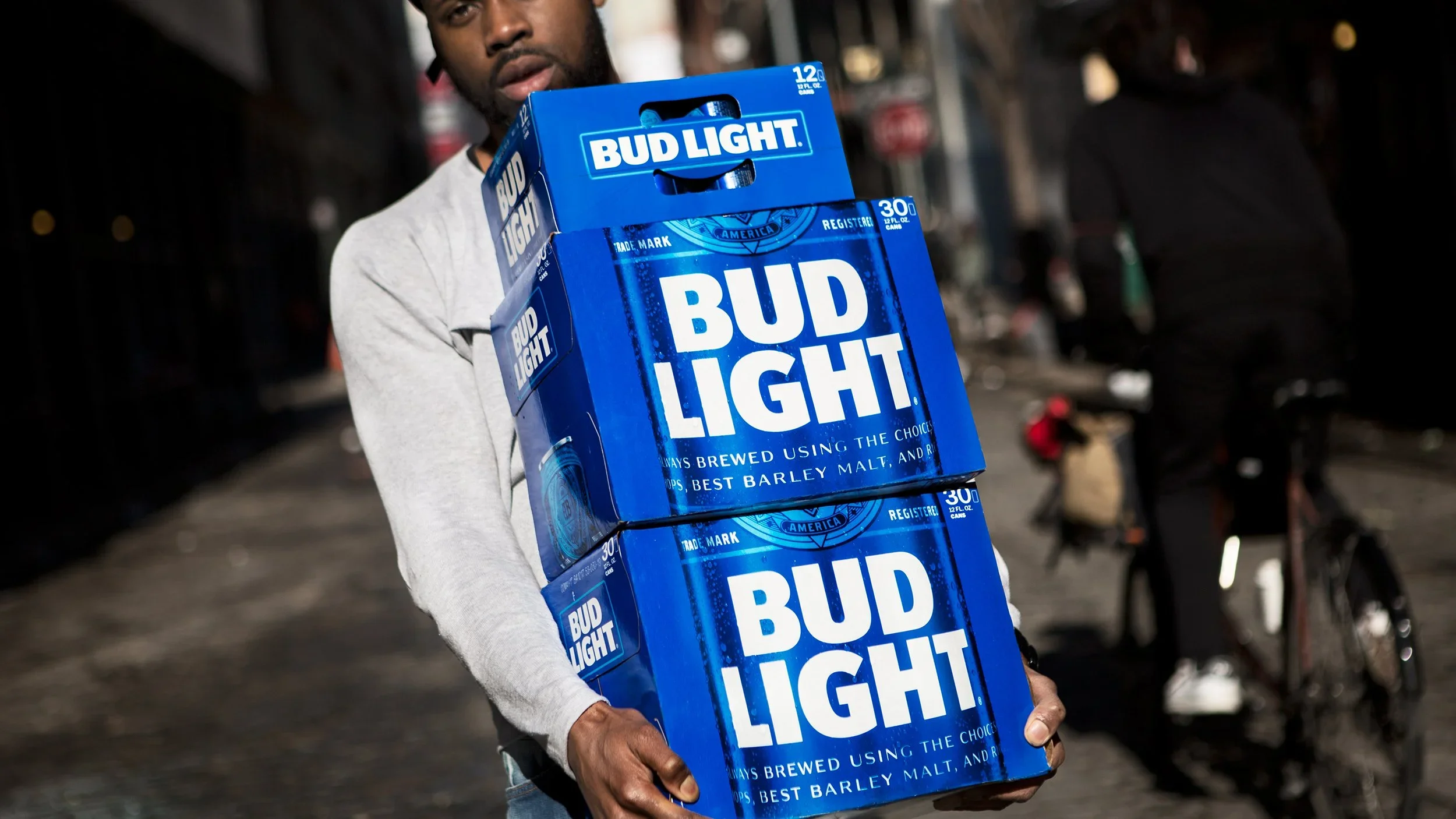
THE OUTCOMEThe result was more than a visual update; it was a cultural recalibration. Bud Light’s identity became whole again: confident, modern, and unmistakably American. The new system unified every expression of the brand, from packaging and advertising to retail and social, reigniting pride both inside and outside the company. The rebrand became a blueprint for how design can drive cultural relevance, shaping Anheuser-Busch's approach to brand transformation across its entire portfolio. It remains one of the most recognized and awarded examples of the evolution of the packaging-to-brand world in modern beer history, proof that when craft meets clarity, even the biggest brands can rediscover their soul.
CREDITS
Industry: CPG, Beer, Beverage
Client: ABI-INBEV
Agency: Jones Knowles Ritchie
Photographer: Martin Wonnacott
My Role: Design Direction & Design
Design: Izgi Yapici, Charles Draper, Cyrus Blais
Typographer: Ian Brignell
Lettering: CLUB
Motion Design: Justin Sottile
Strategy: Danny D’arcy
Markets: North America & Global
Scope: Brand Strategy, Brand Architecture, Brand World System, Product Photography, Product Innovation, Packaging Innovation, Regional partnerships, Sports Partnerships