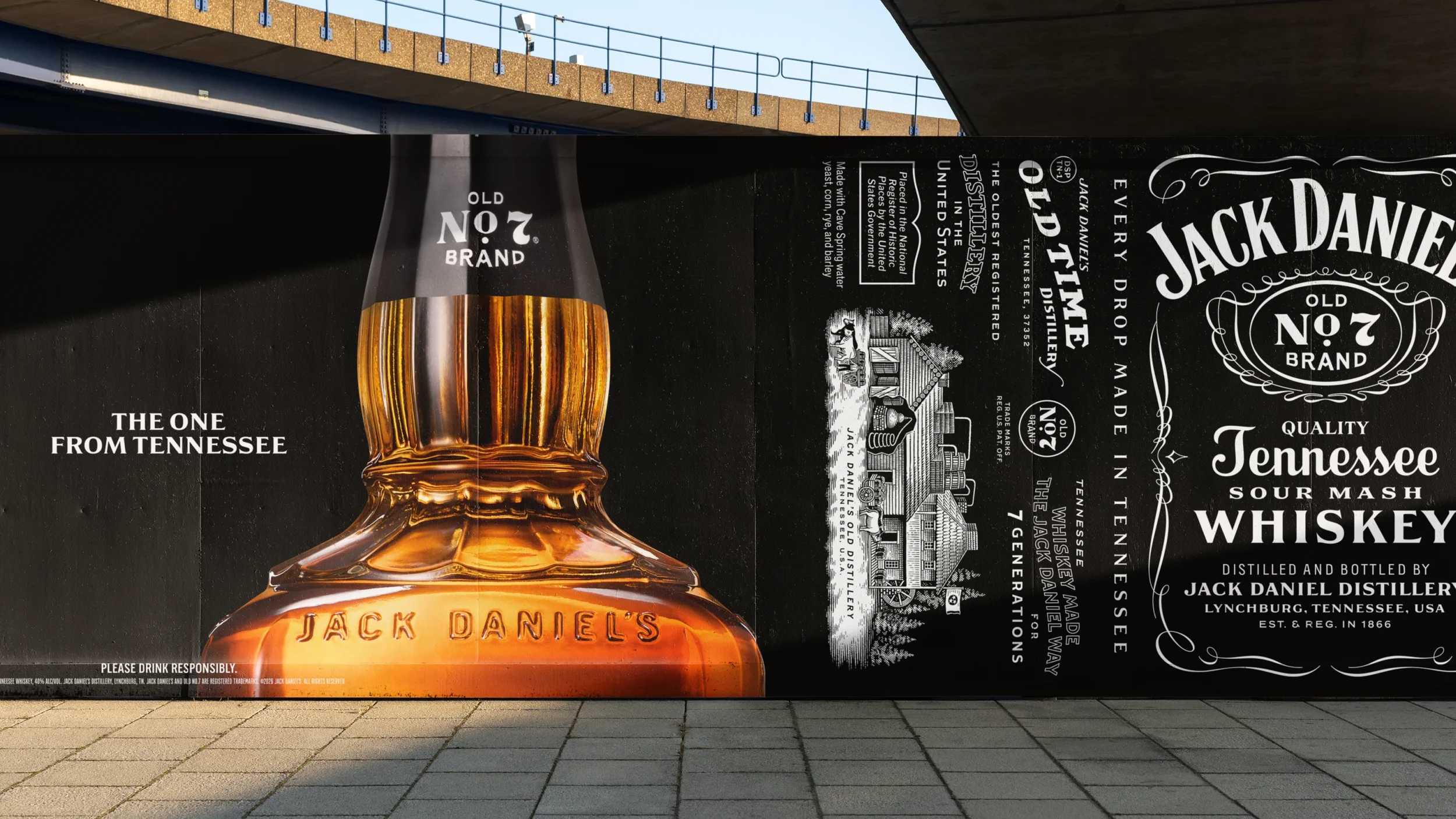
The one from Tennessee
Making your stories better since 1866.
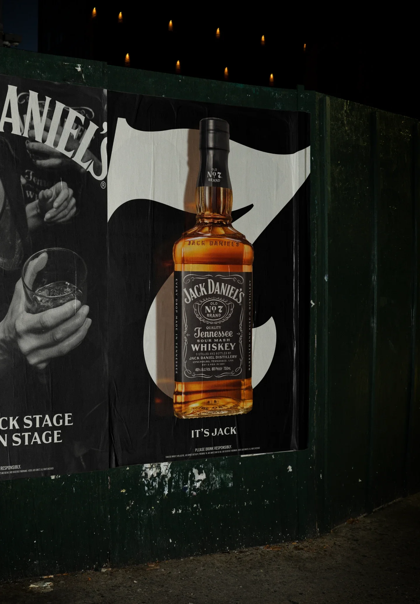
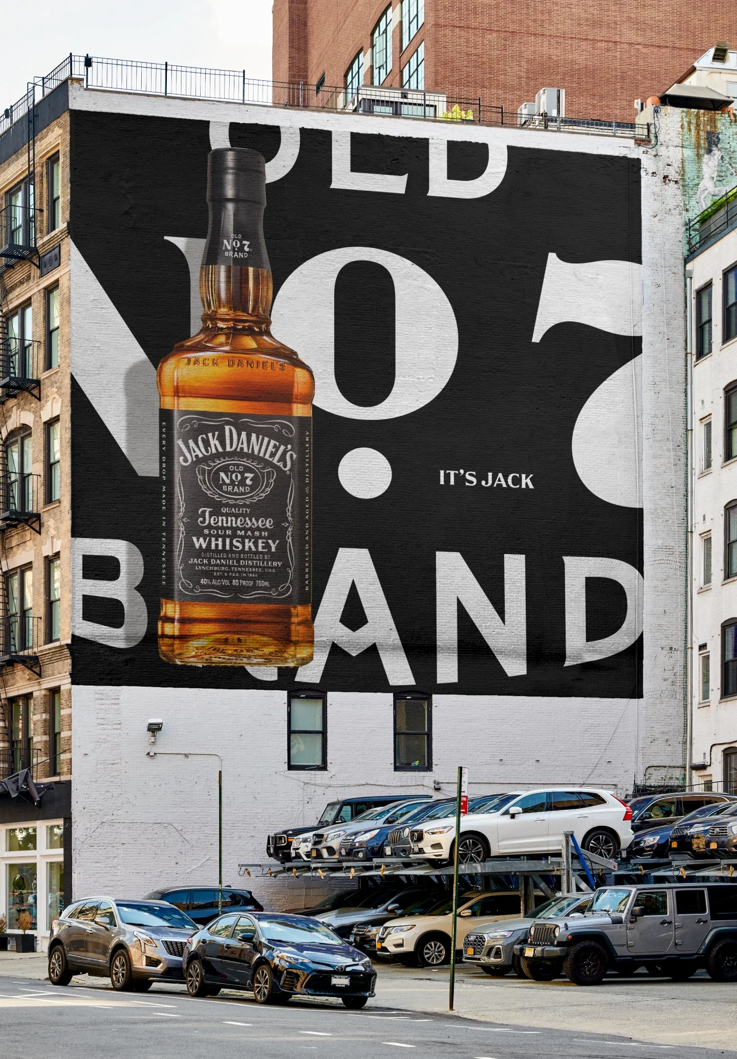
It’s Jack.
-
Building a Branded House for the World’s Most Iconic Whiskey
THE CHALLENGE
Jack Daniel’s is one of the most recognizable brands on earth, yet by the early 2020s, its visual world was starting to work against it.
Years of delayed launches, fragmented portfolios, regional executions, and shifting strategies had left the brand diluted and inconsistent. Despite a redesigned bottle and a new global campaign, consumers described Jack as familiar, but no longer distinctive. Internally, teams struggled to scale work with confidence. Externally, the category was exploding with premium challengers, eroding Jack’s perceived quality and cultural relevance. The task wasn’t to redesign Jack Daniel’s.
It was to re-establish its authority, clarity, and confidence, everywhere it showed up.Objective
Create a Branded House Global Design System that could:
Regain cultural and category relevance
Elevate quality perceptions across the portfolio
Unify a fragmented family of expressions
Equip a global network of teams and partners with clear, inspiring guidance
All while remaining unmistakably Jack.
Insight
Research revealed a hard truth:
“You don’t lose any points by drinking Jack…But you don’t gain any either.”
Jack wasn’t lacking awareness—it was lacking BADGE VALUE. The opportunity wasn’t a reinvention. It was a focus: returning to what had always made Jack powerful, confidence, restraint, craft, and conviction, and expressing it through a modern, scalable system. The answer was simple, if not easy:
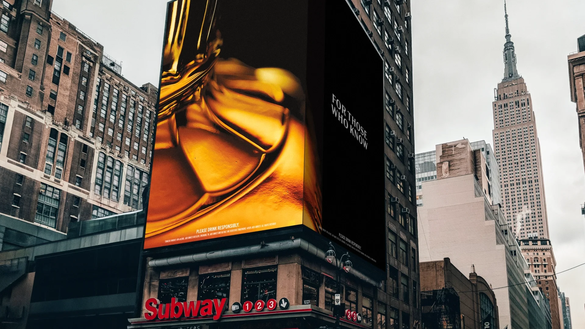
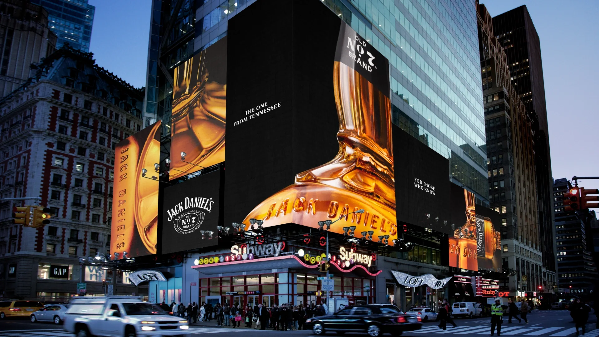
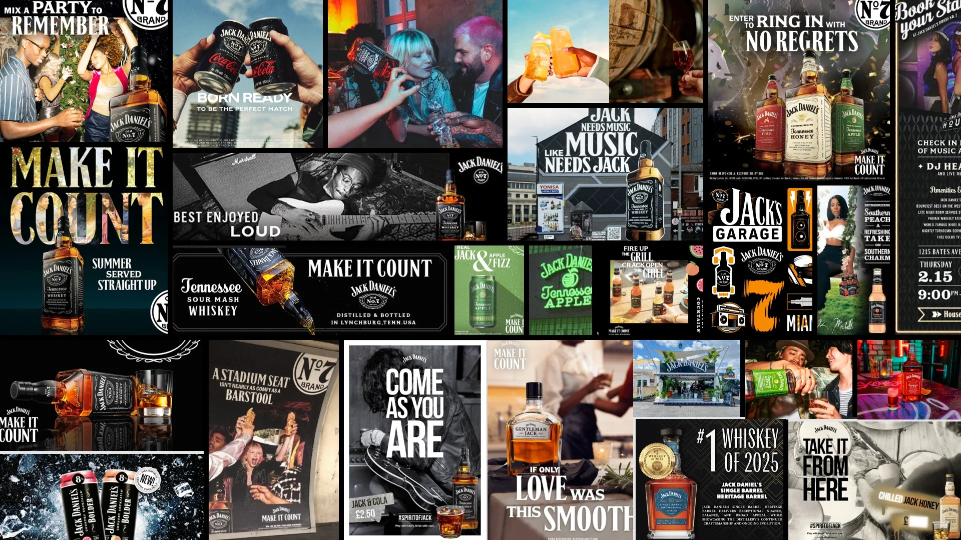
Get Back to Black. It’s JACKThe Work
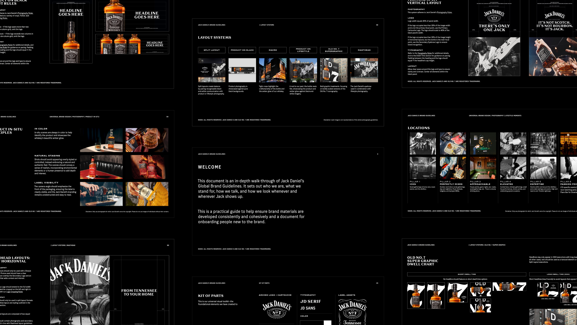
We built a cohesive brand world that scales across products, channels, and cultures, anchored in six foundational system pillars.
1. Regaining Brand Relevance
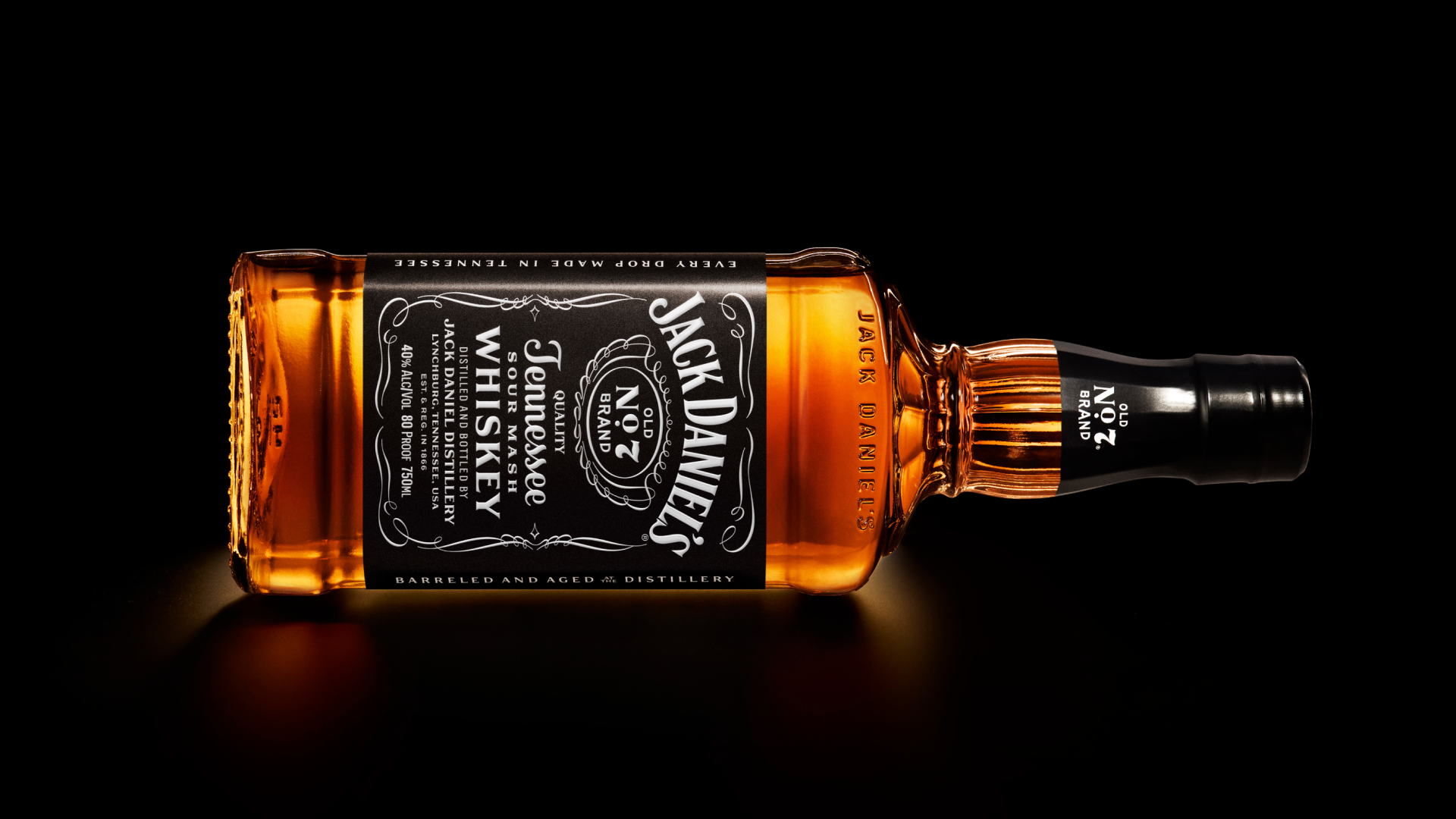
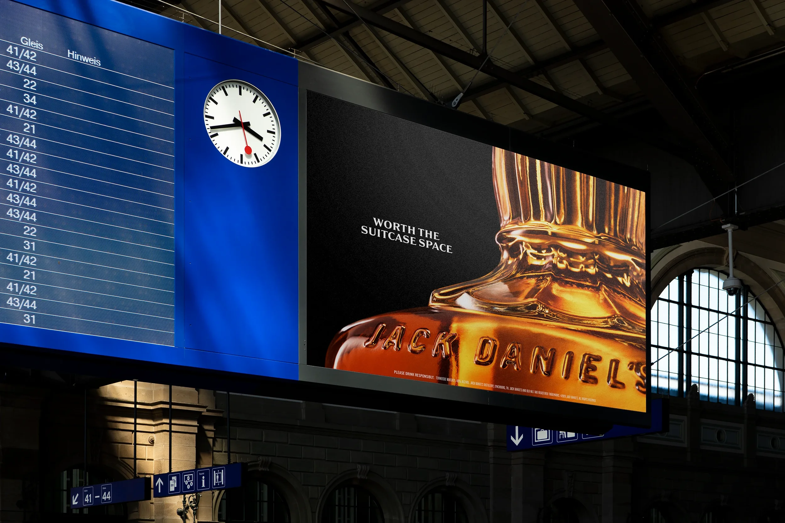
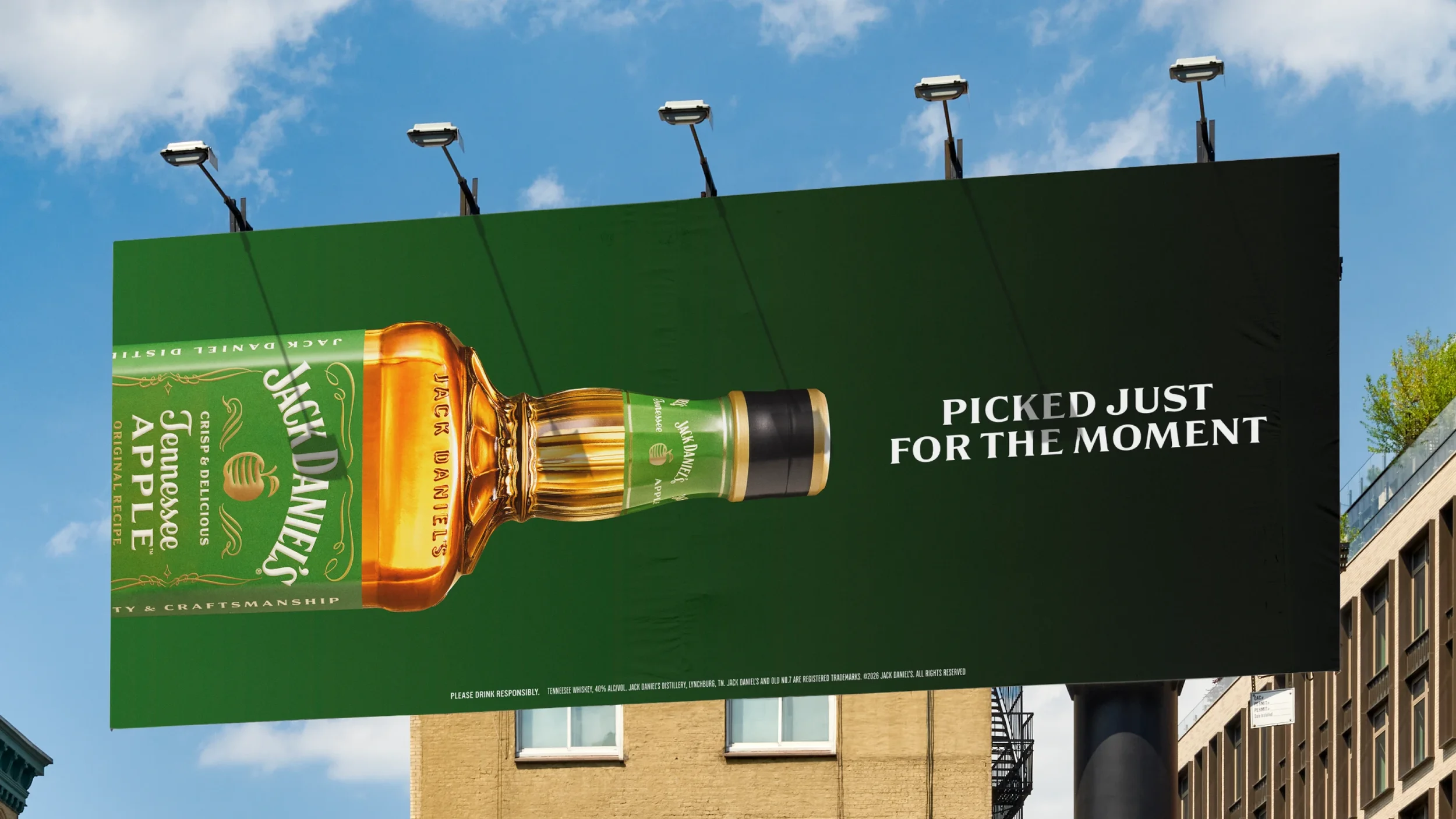
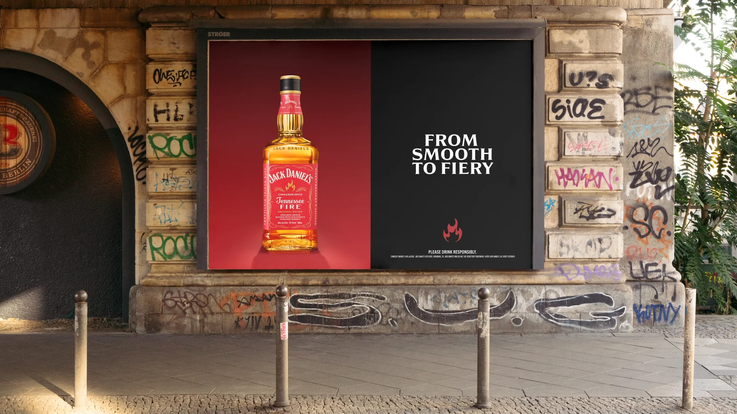
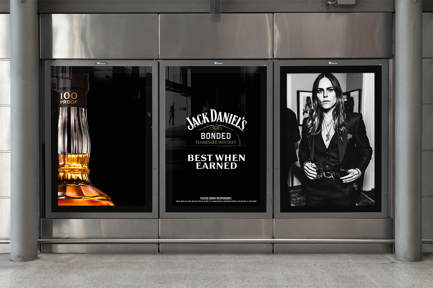
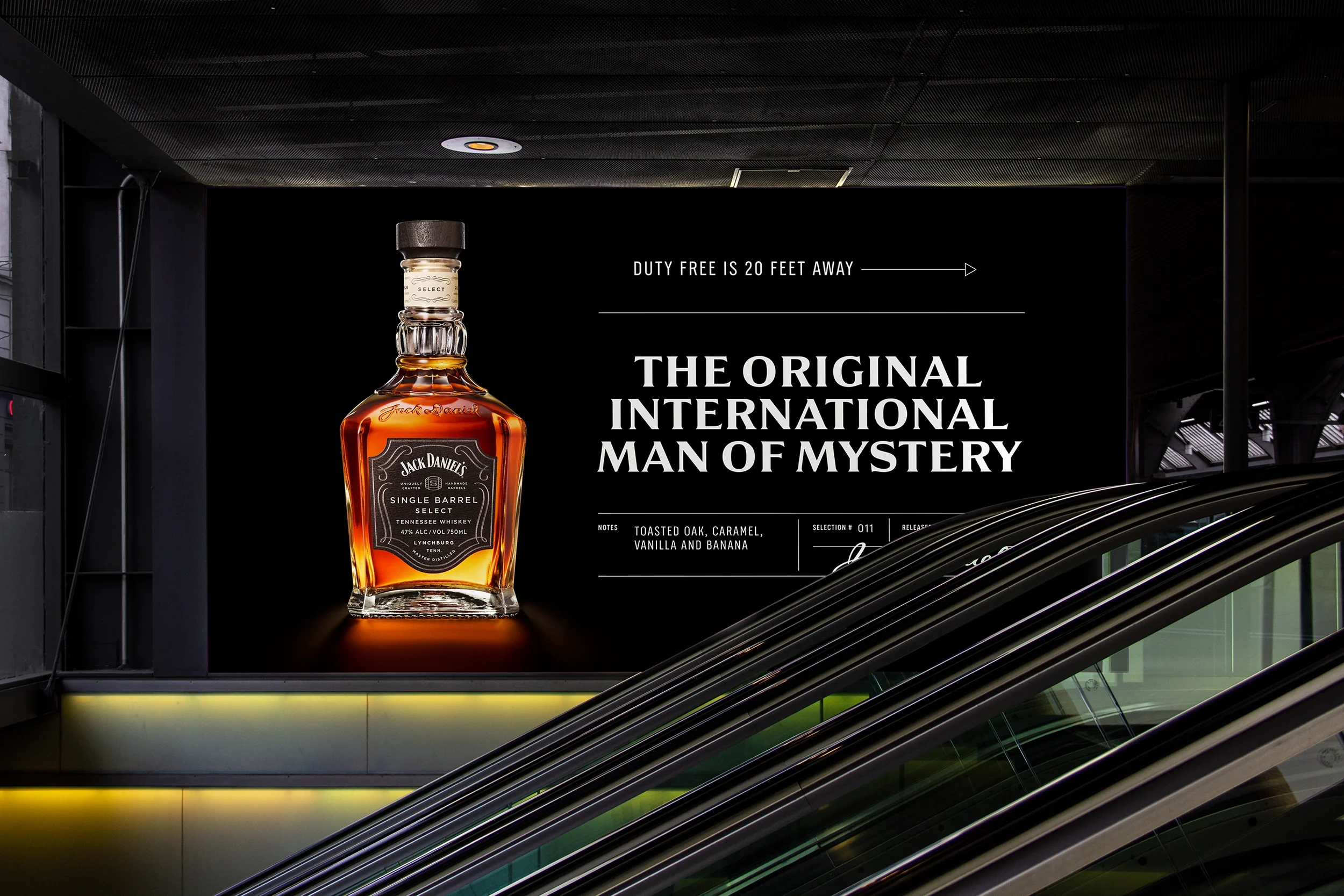
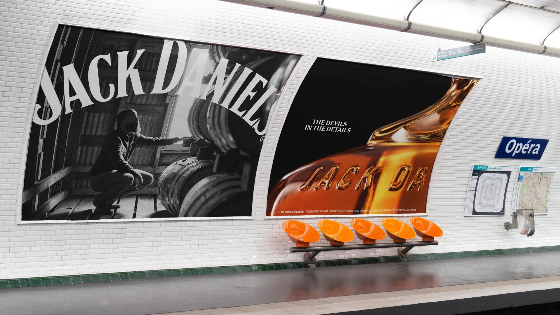
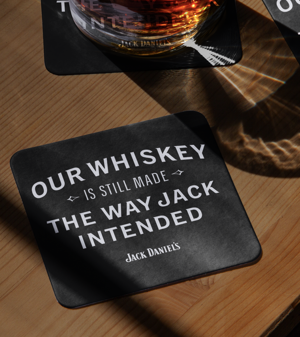
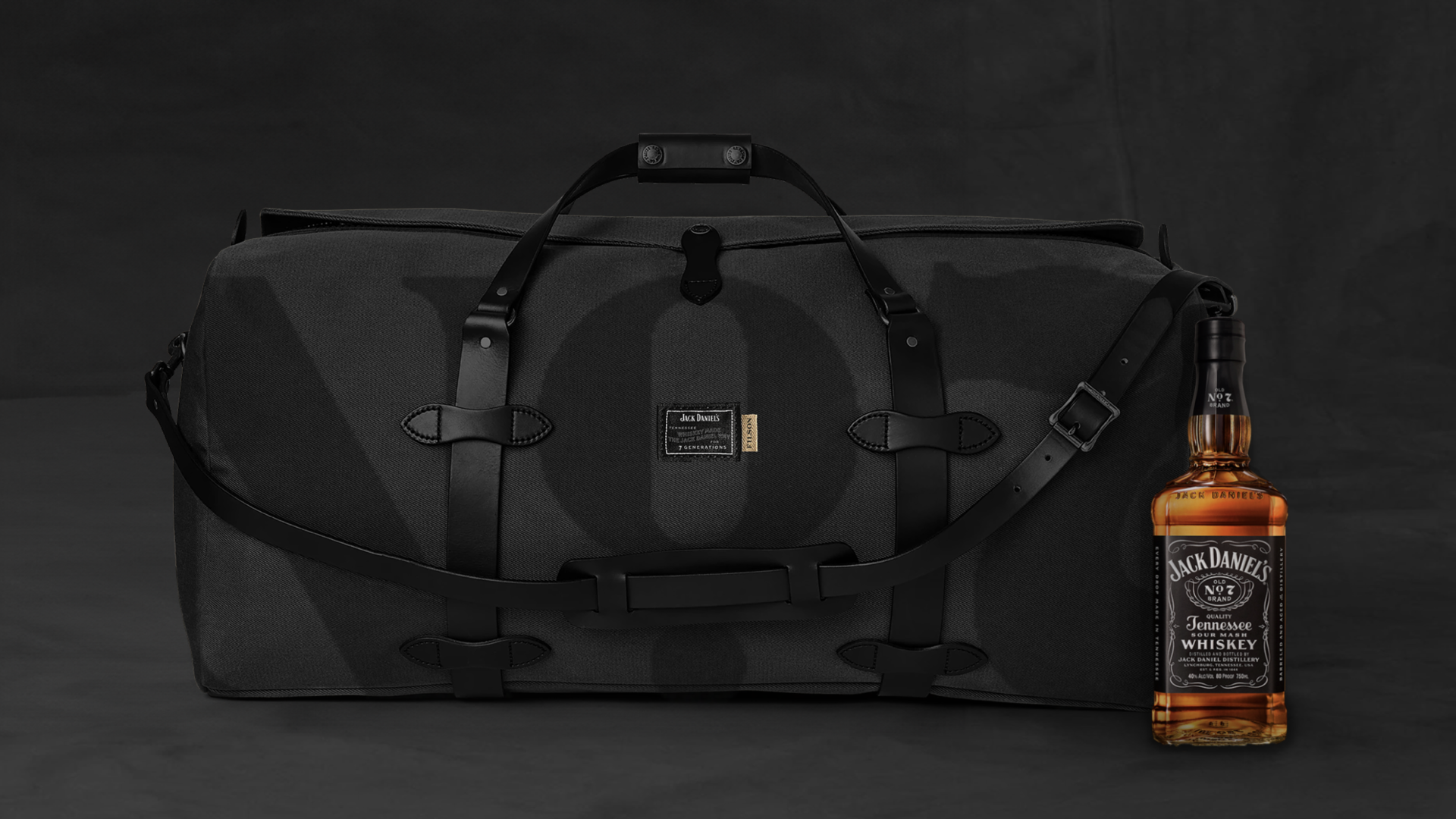
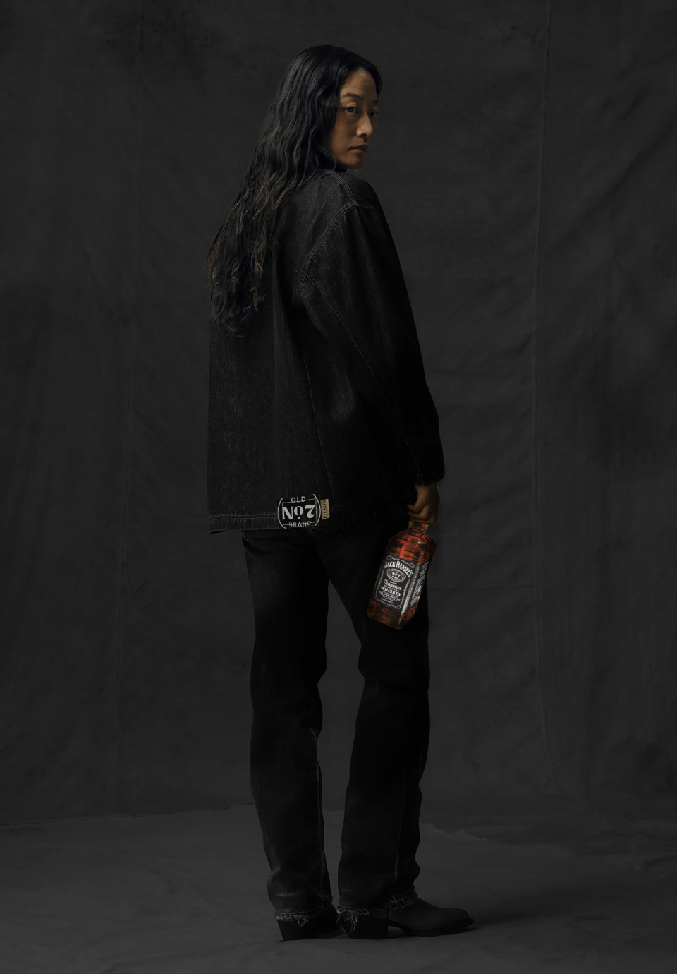
We re-established Jack Daniel’s as a modern cultural authority by clarifying its visual voice, bold, restrained, and unmistakably confident. Black wasn’t a color choice; it was a statement. The brand stopped chasing attention and started commanding it.
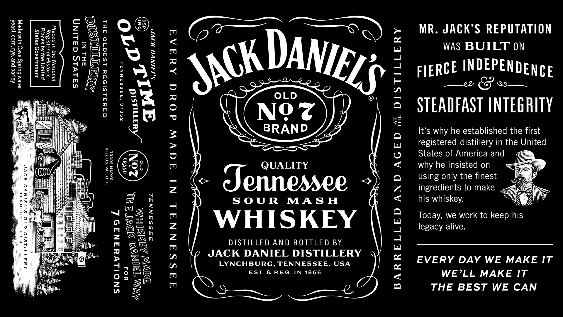
2. Distinctive Global Guidelines
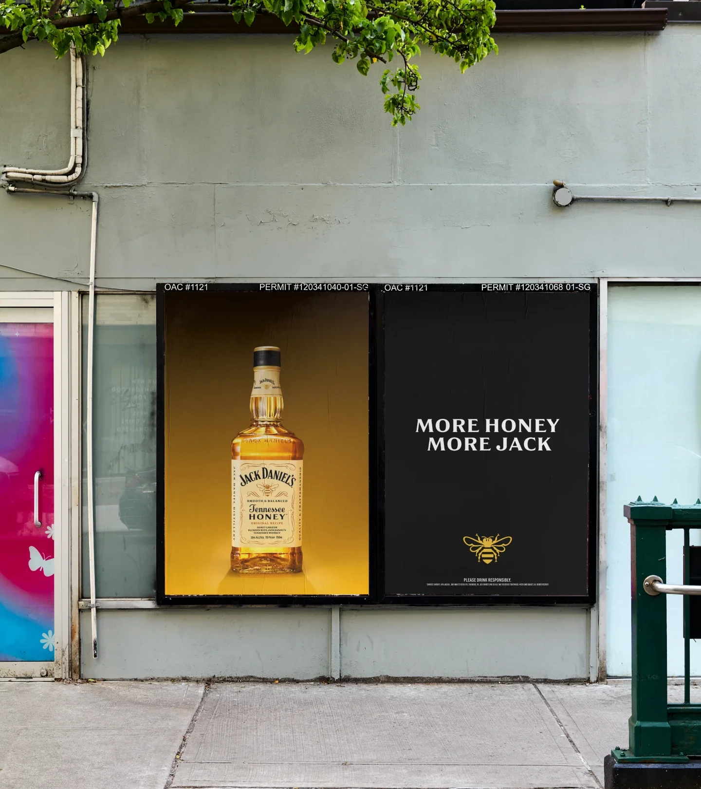
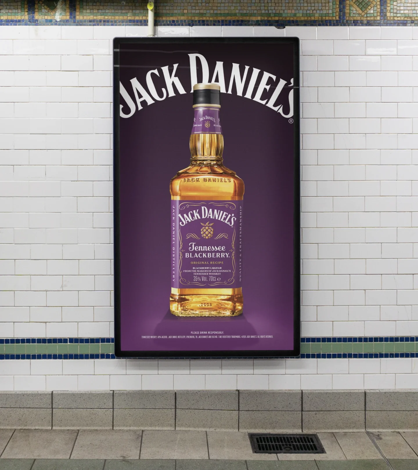
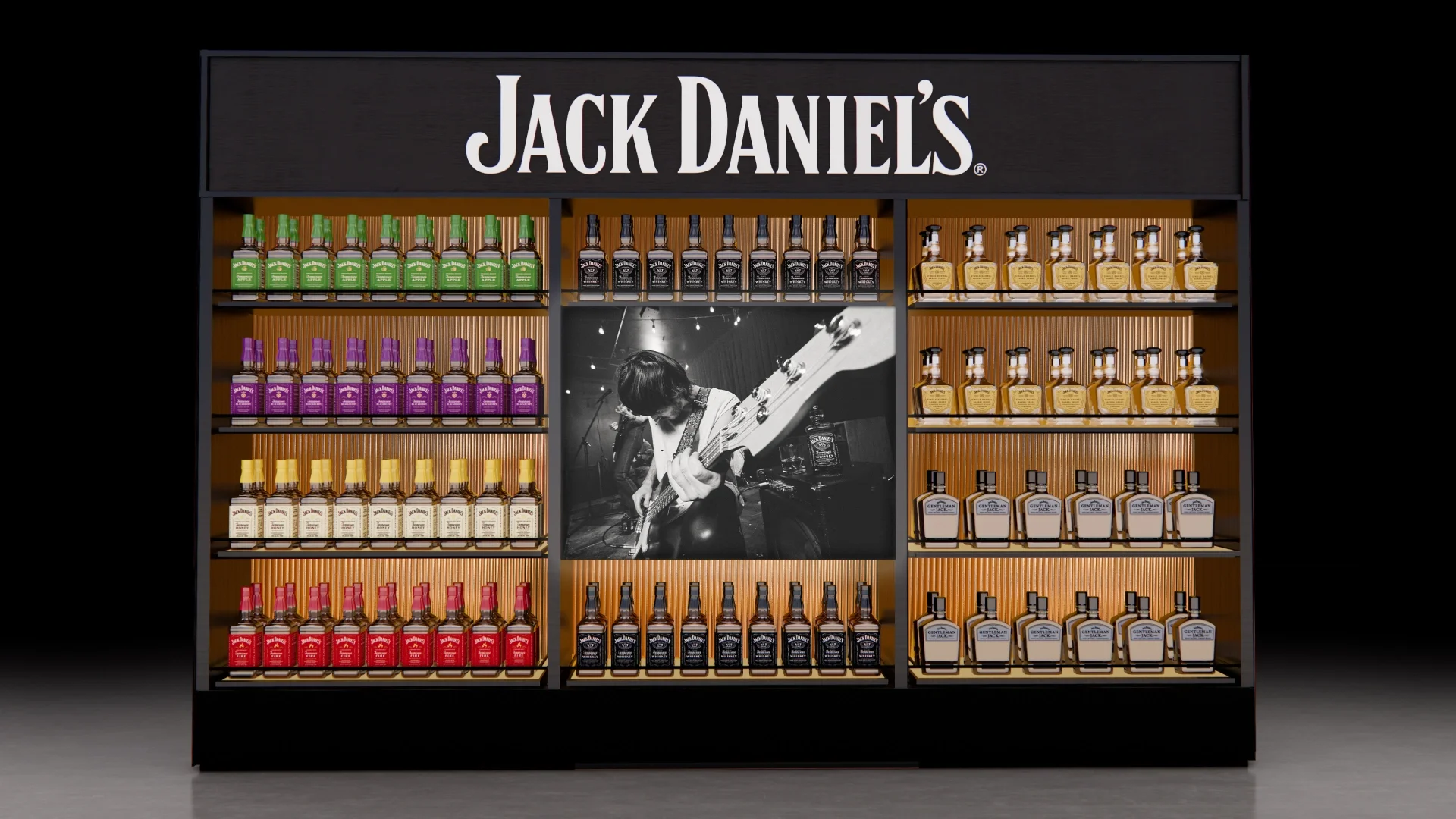
We created a modular, Branded House framework that empowered teams without limiting creativity. Each expression, from Old No.7 to Flavors, Single Barrel to Bonded, could flex with purpose, while always paying back to the masterbrand. The result: global consistency without sameness.
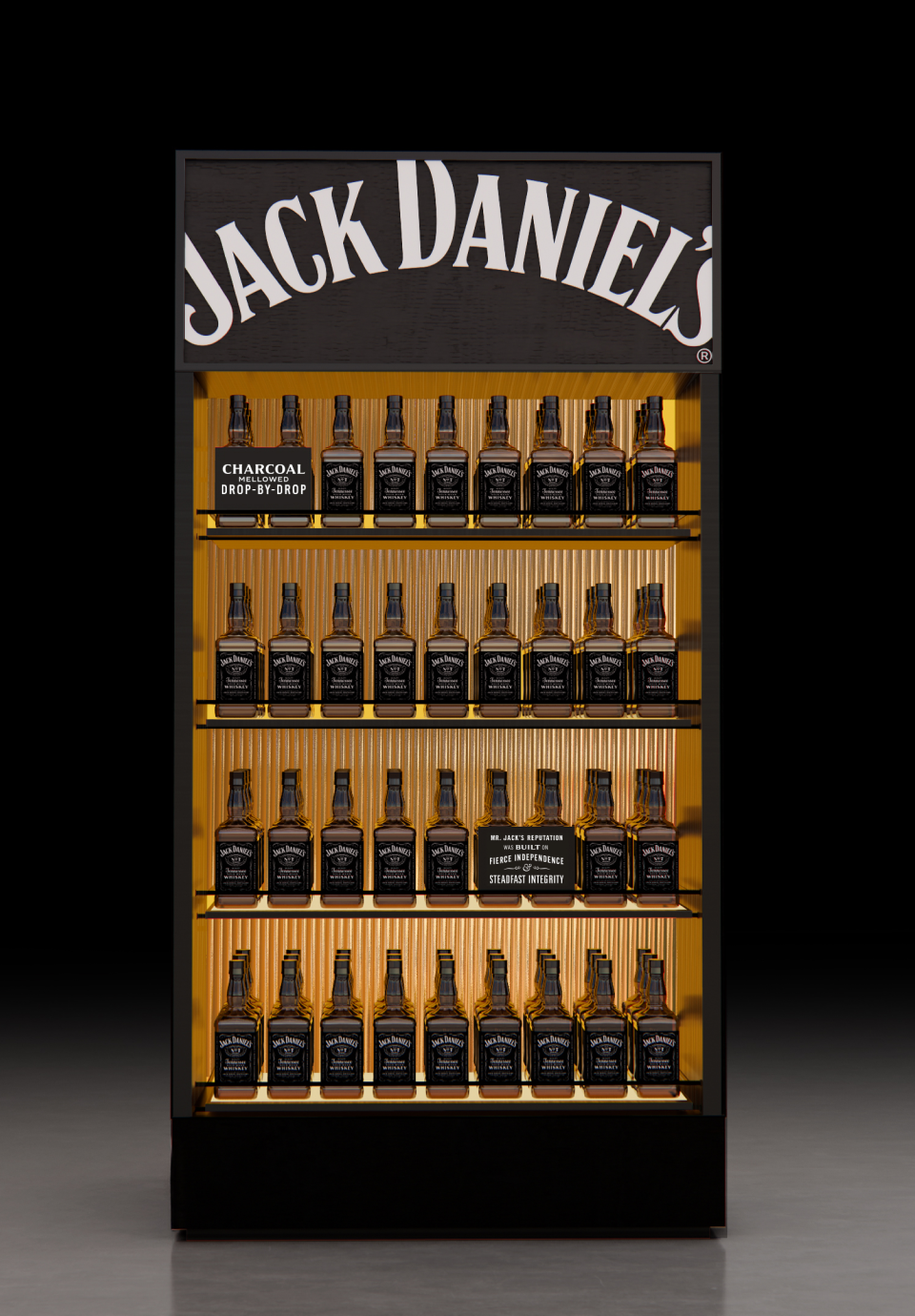
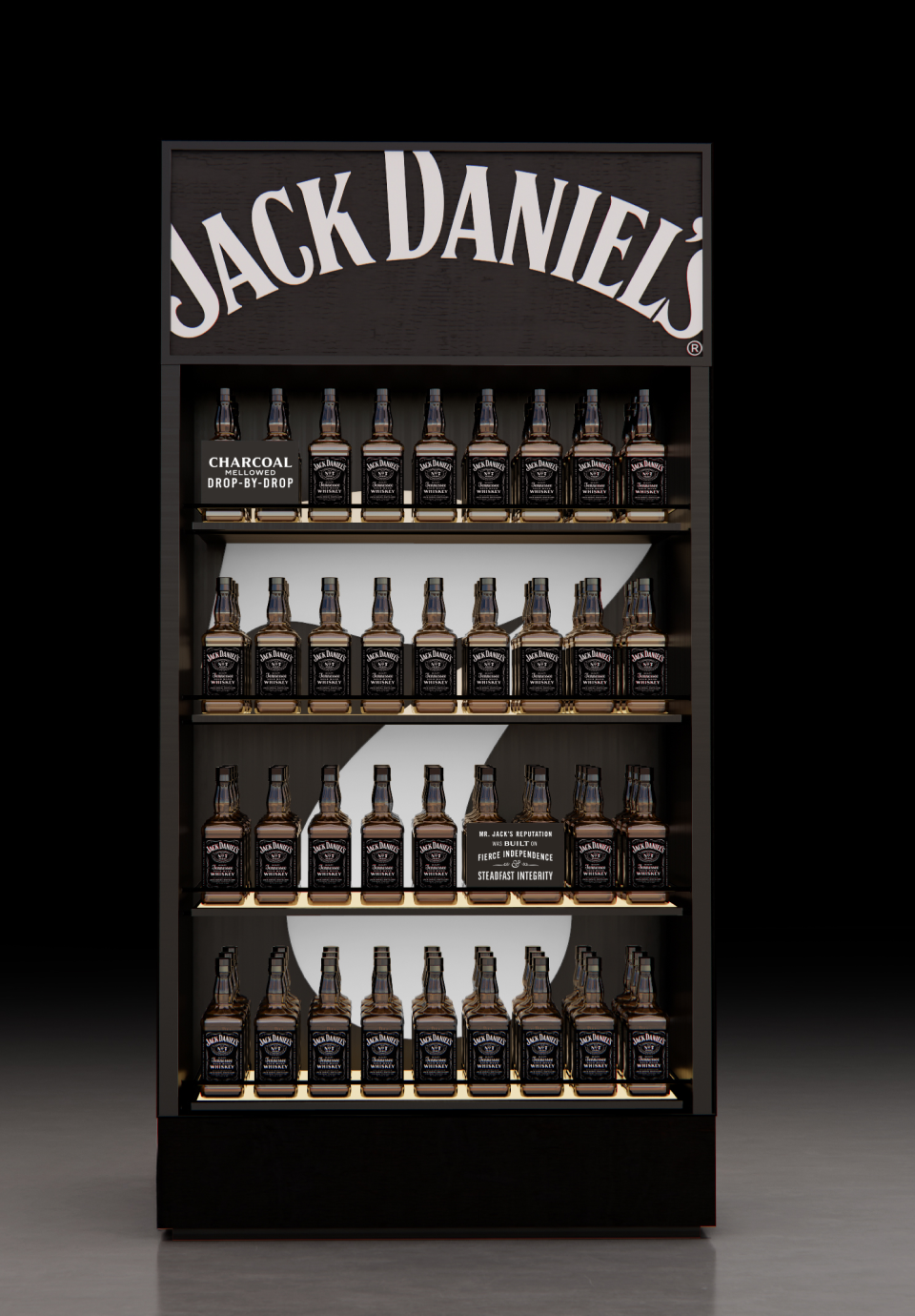
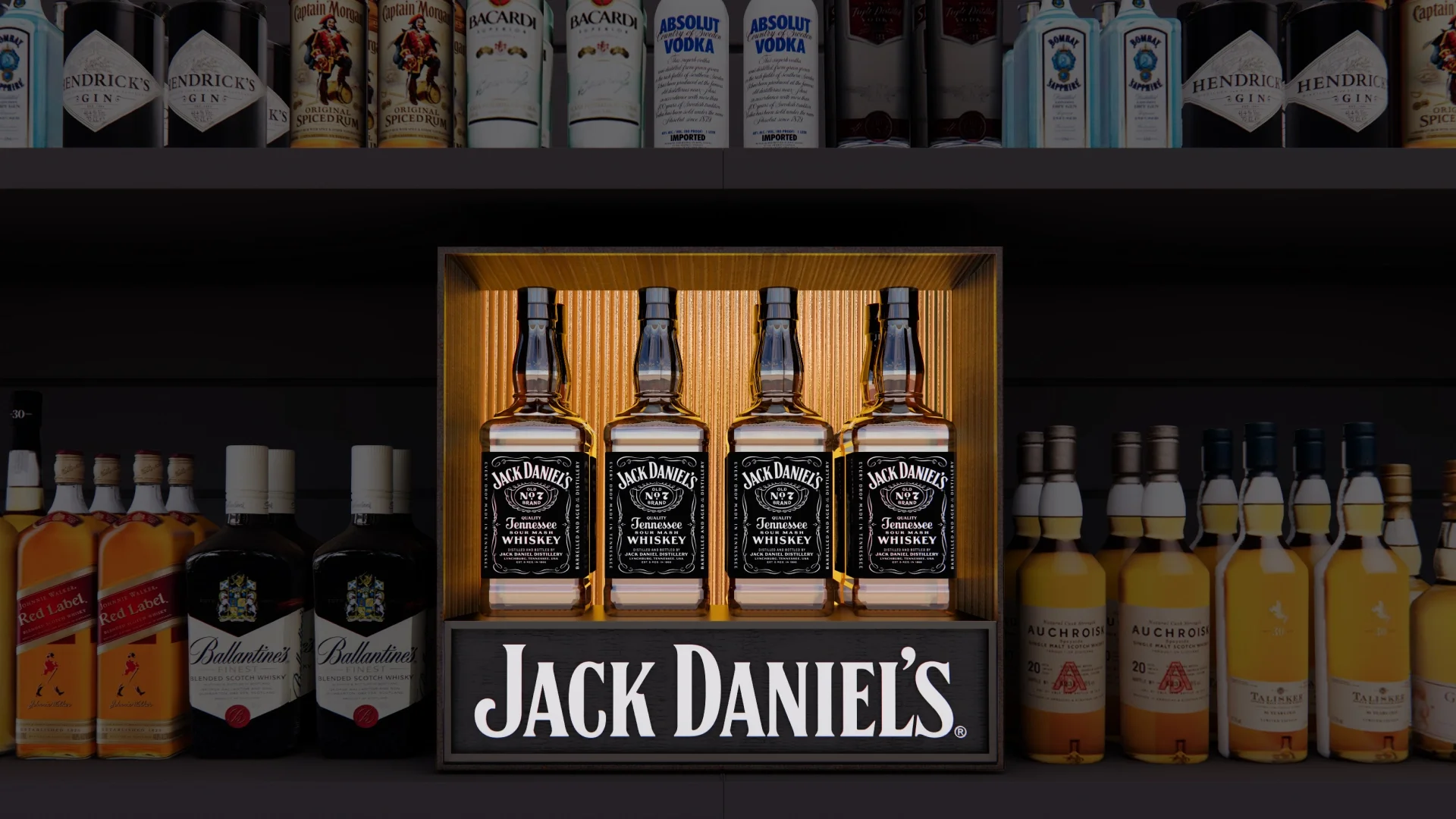
3. A Cohesive Visual Architecture
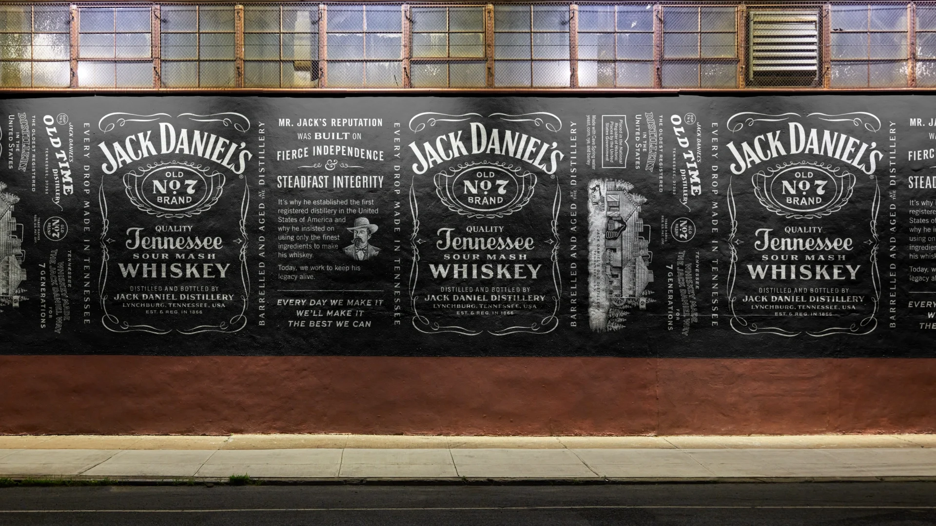
We aligned the full portfolio into a clear, hierarchical system, bringing order to bottle shapes, labels, finishes, and naming conventions. For the first time, the Jack Daniel’s family looked like it belonged together.
4. Re-establishing Quality Perceptions
Through disciplined design choices, materials, lighting, typography, and layout, we elevated Jack’s presence across every touchpoint. The brand moved from familiar to premium without losing its soul.
5. Custom Typography & Graphic Language
We refined and extended Jack’s proprietary typographic system, balancing heritage with clarity. Letterforms, spacing, and hierarchy were treated as assets, not decoration, reinforcing authority at every scale.
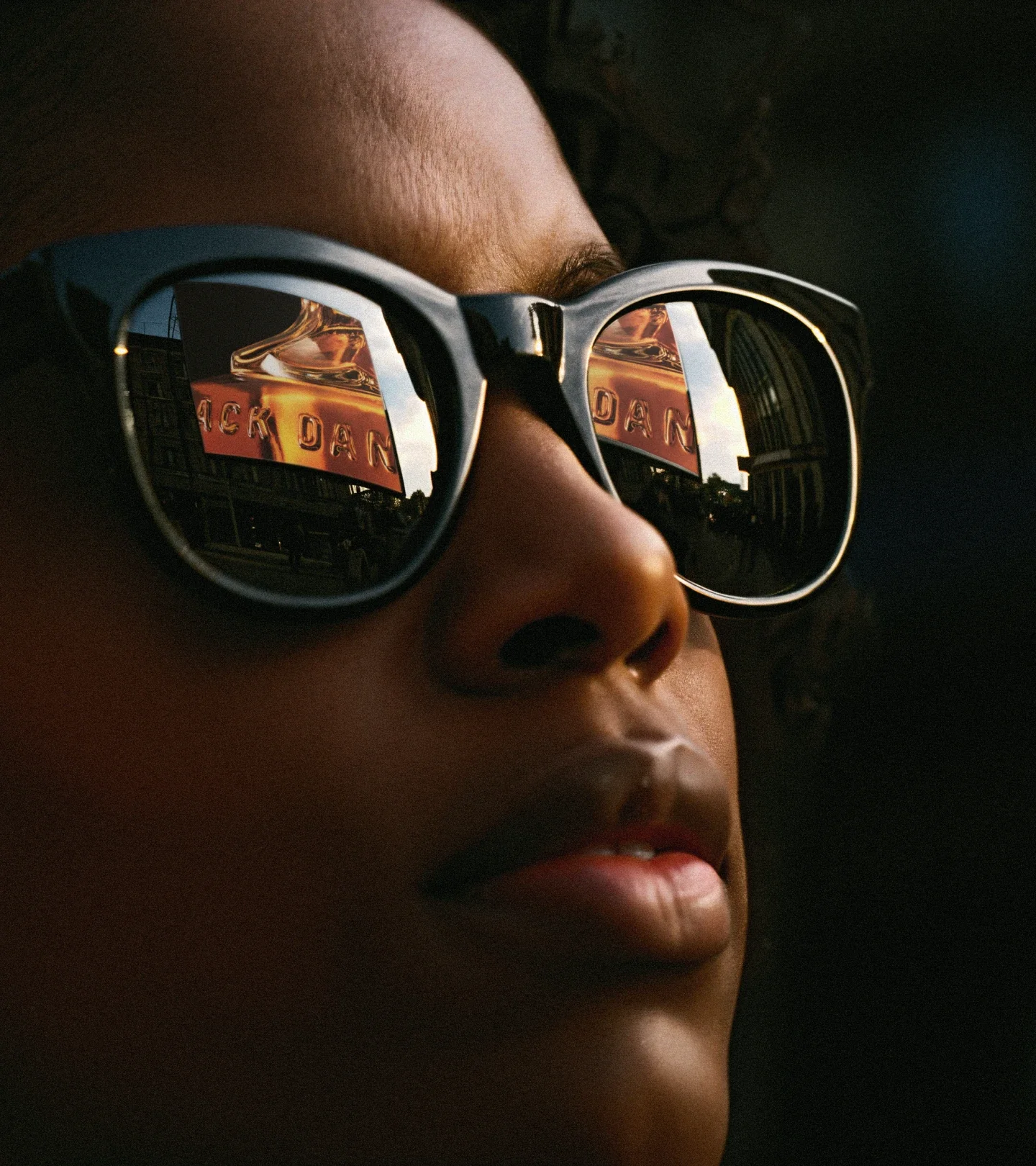
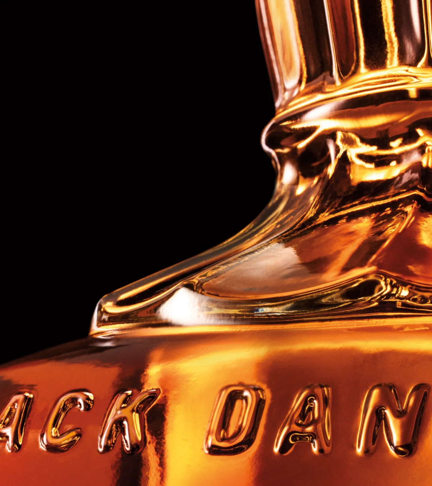
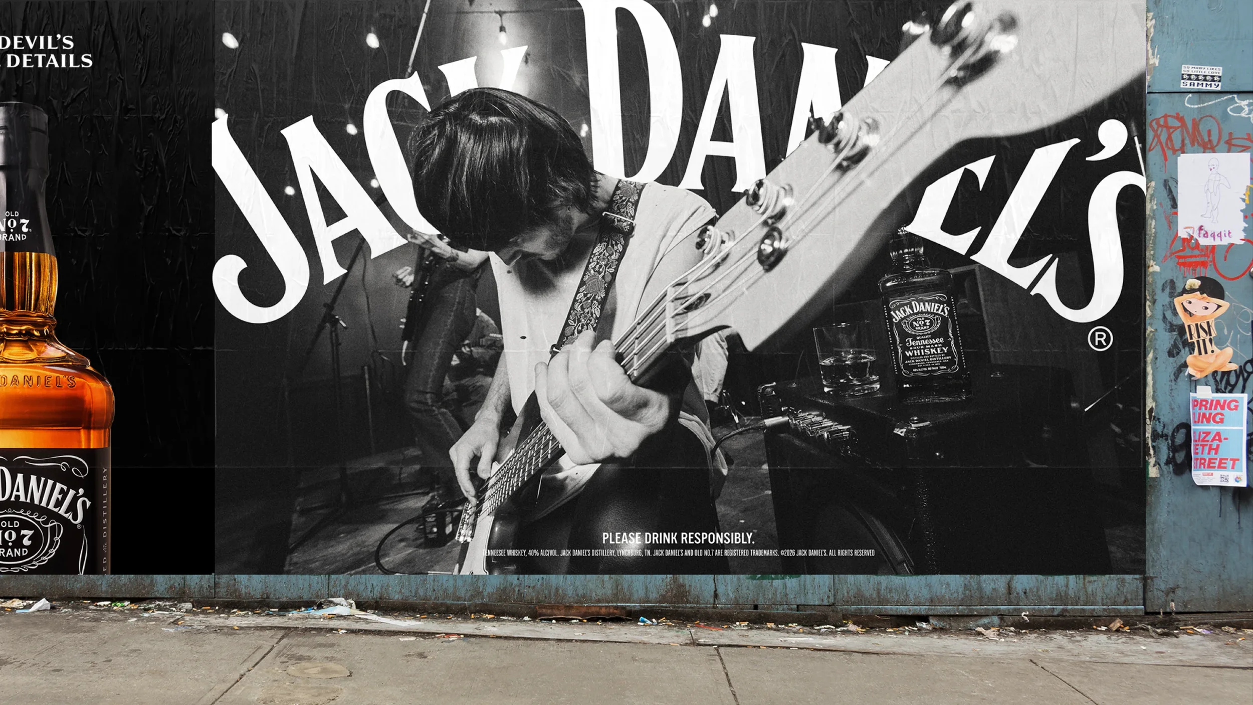
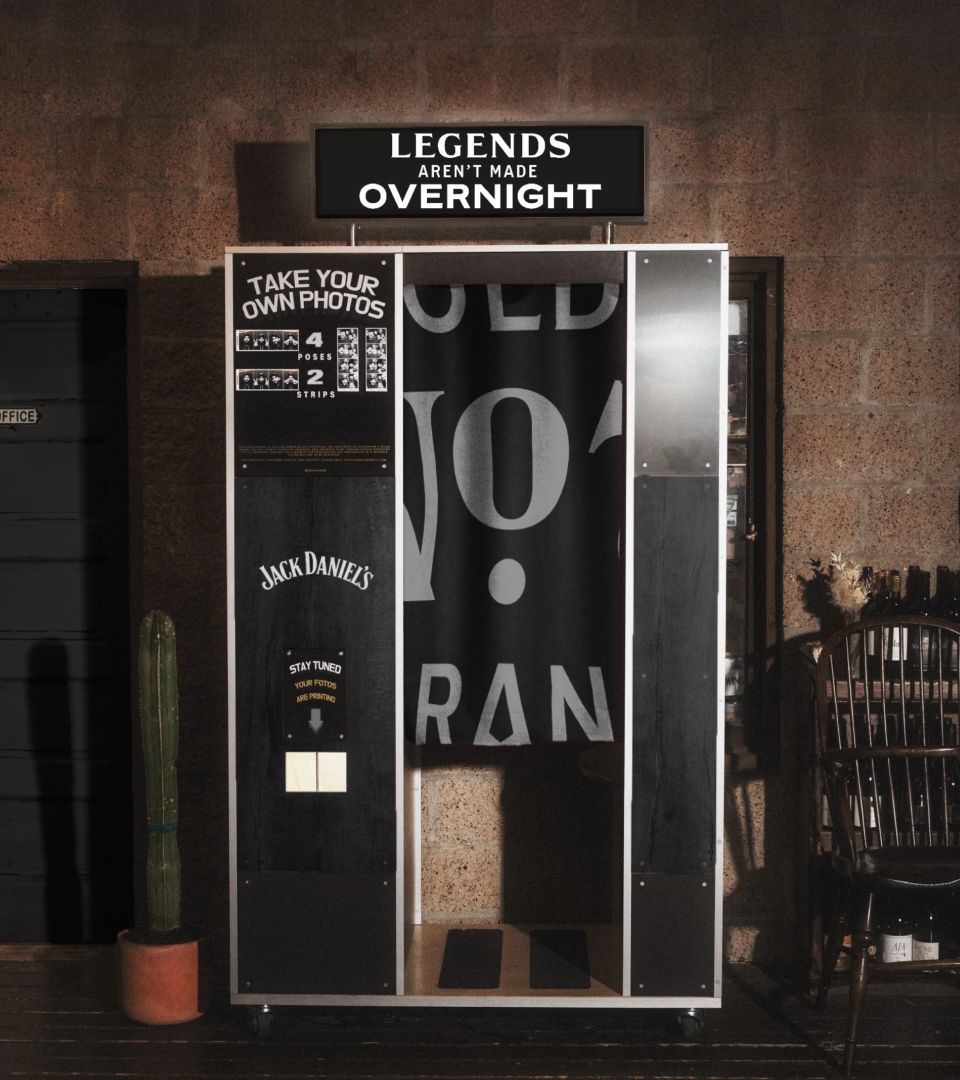
6. A Full Sensory Brand World
Jack Daniel’s isn’t just seen, it’s felt.
We defined principles and frameworks across:
Product photography - macro and lifestyle
Motion - pace, weight, restraint
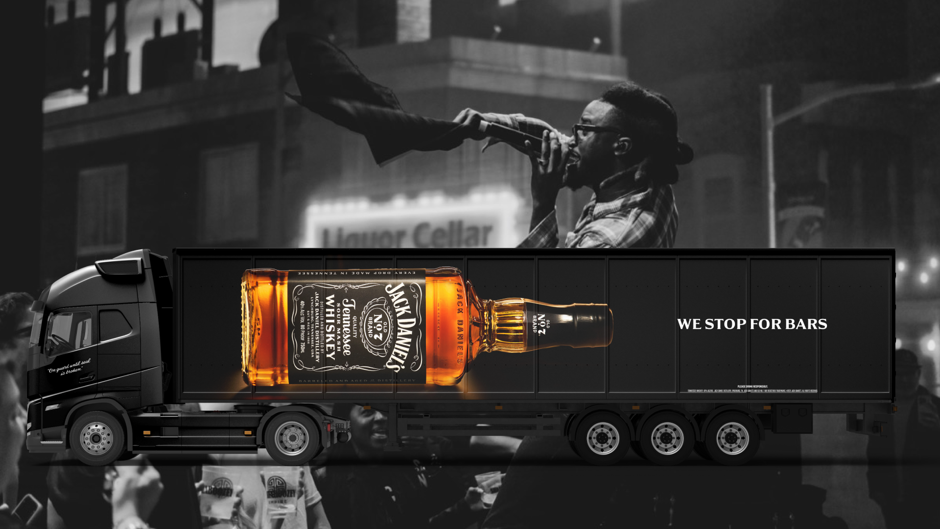
Experiential design - on-premise, off-premise, retail, events
Sonic expression, ensuring the brand sounded as confident as it looked
Each piece reinforced the same idea: quiet confidence, built to last.
IMPACT
The new Jack Daniel’s Brand World served as the foundation for the global rollout, guiding everything from packaging and OOH to retail, experiential, and campaign work. More importantly, it gave Jack back its edge: Clear leadership in a crowded category, elevated quality perceptions across the portfolio, a scalable system built for growth, not just launch. Jack Daniel’s wasn’t reinvented. It was reclaimed to become the world's most valuable and iconic spirit brand.
CREDITS
Industry: CPG, Liquor
Client: Brown-Forman - Jack Daniel’s
Agency: Jones Knowles Ritchie
Photographer: Martin Wonnacott
My Role: Creative Director
Design: Kim Melvin, Orion Janeczek
Motion Design: Stubbs Johnston
Strategy: Maxwell McBride Peterson, Max Arevuo
Markets: North America & Global
Scope: Brand Architecture, Global Brand Evolution, Motion System, Brand Experience, Custom Type, Photography System
Challenge - A fractured house of brands and low consumer quality perception
Outcome - A branded house with a holistic design system driving quality and authenticity