Thyme Care, Devotion Every Day
Envisioning a brand that doesn’t just guide patients through cancer, it walks beside them.
-
THE CHALLENGE
Thyme Care came to us with a mission that was as emotional as it was essential: to help people navigate the unknowns of a cancer diagnosis with understanding, clarity, and compassion. As an oncology management platform, they weren’t just creating a service; they were offering a lifeline at one of life’s most vulnerable moments.The challenge was clear: build a brand that feels as human as the people it serves.In an industry dominated by sterile design and corporate tones, Thyme Care needed to project warmth without sacrificing credibility, and empathy without sacrificing authority. The task was to create a brand that inspired trust among major healthcare providers while connecting deeply with patients and caregivers.
Discovery
Our process began with listening to patients, care teams, and the founders themselves. What we consistently heard was a desire for connection and reassurance: a brand that didn’t just inform, but also understood. That insight guided everything. We needed a name and system that embodied care as devotion, not obligation. In our exploration, we discovered the Thyme plant, known throughout history for its healing properties, protective uses, and symbolism of friendship and devotion.
From this came the name Thyme Care, a reflection of their brand promise:
“Devotion, every day, to everyone affected by cancer.”
It was simple, sincere, and full of meaning, a name rooted in humanity, not healthcare jargon.
Craft
We built the brand from the heart outward, balancing compassion with credibility at every level.
Identity & Symbol:
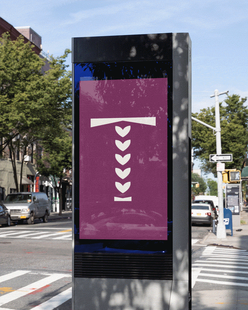
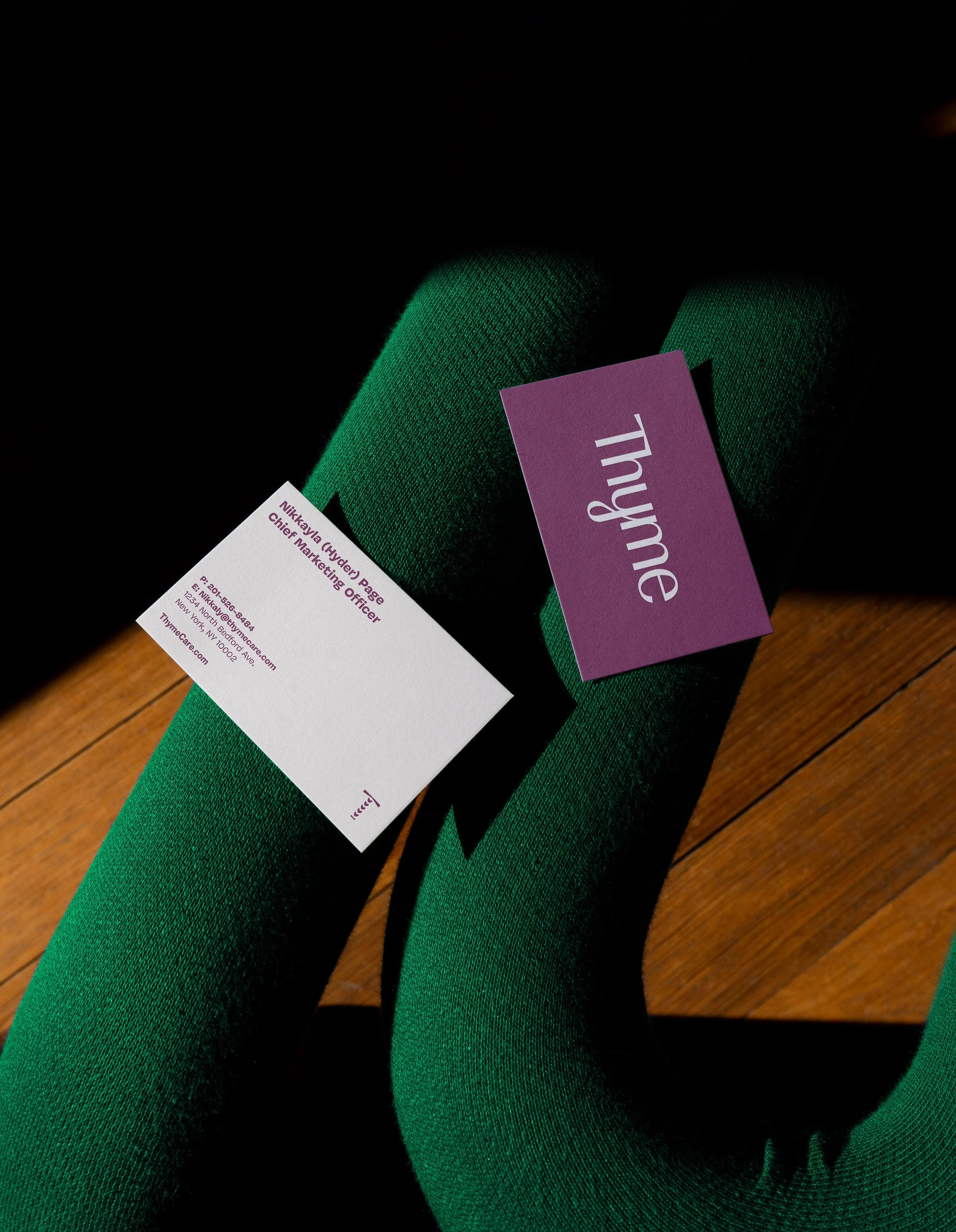
The custom wordmark balances structure and softness. The strong “T” conveys trust, while the organic curve of the “Y” adds a human touch. From the “T,” we crafted a brand icon inspired by thyme buds that subtly form a heart, a universal signal of care and compassion.Color & Emotion:
Instead of leaning into the clinical blues or overused greens of the healthcare space, we turned to the pink and purple blossoms of thyme. These hues feel human, calming, and distinctive, setting Thyme apart in a sea of sameness.Illustration & Expression:
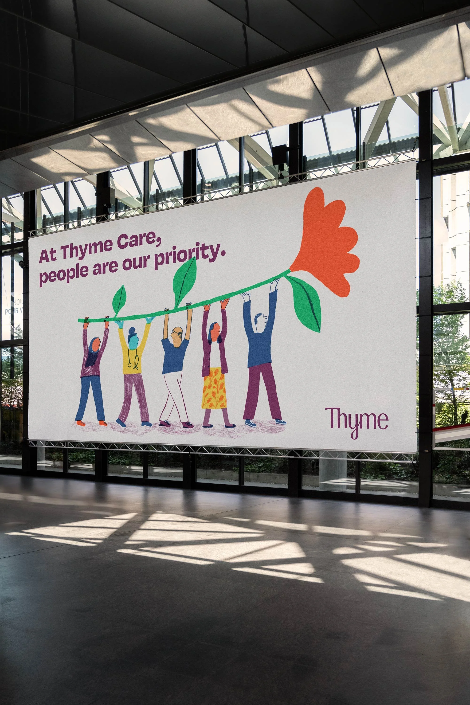
Because words alone can’t always hold the weight of the cancer journey, illustration became a key brand asset. We developed a style that conveys connection, empathy, and empowerment, communicating visually what can’t always be said aloud.Digital Experience:
We extended the warmth of the identity into the website design, creating a digital environment that feels intuitive, inclusive, and reassuring for both patients and providers. Clean layouts, gentle animation, and an accessible UX make every interaction easier, both emotionally and functionally.Systems & Tools:
A digital-first business suite ensures the brand’s values extend across internal and external communications. Every touchpoint, from onboarding to partner presentations, reinforces the same message: care, clarity, and compassion at every step.
OUTCOME
The result is a healthcare brand that leads with heart, proof that empathy and innovation can coexist.
Thyme Care’s new identity and system bring a sense of humanity to oncology, showing that design can be as much about healing as it is about communication.By grounding the brand in devotion and dignity, Thyme Care redefined what trust looks like in healthcare, not just through words or visuals, but through every patient experience.
CREDITS
Industry: Healthcare
Client: Thyme Care
Agency: Super Okay
Illustrator: Charlotte Ager
Developer: TBD
My Role: Creative Direction & Design
Design: Anthony Capetta
Markets: North America
Scope: Naming, Brand Strategy, Brand World Design System, Illustration, Website, UI/UX